Plot Customisation with doped
All the plotting functions in doped are made to be as customisable as possible, and also return the Matplotlib Figure object, so that you can further customise the plot as you see fit.
Tip
You can run this notebook interactively through Google Colab or Binder – just click the links! (Then uncomment the !pip install... cell).
# # If running on Colab; uncomment to install doped, clone the repo to download the example data and cd in to examples folder:
# !pip install doped
# !git clone https://github.com/SMTG-Bham/doped
# %cd doped/examples
Defect Formation Energy Plotting
%matplotlib inline
from monty.serialization import loadfn
CdTe_thermo = loadfn("CdTe/CdTe_thermo_wout_meta.json.gz")  # load our DefectThermodynamics object
Basic formation energy plot:
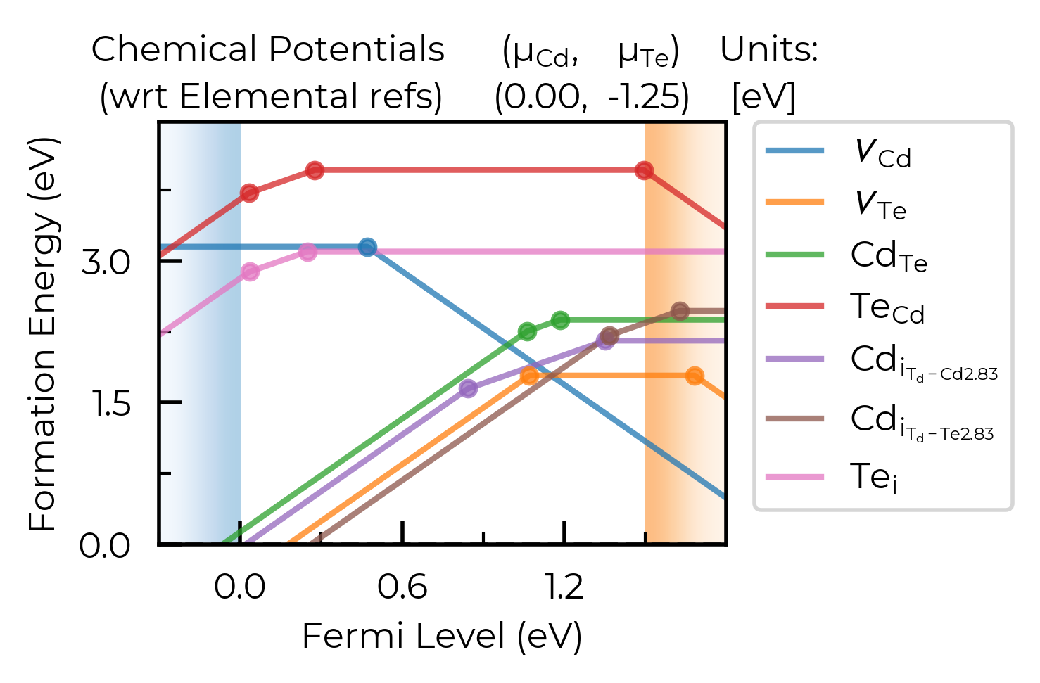
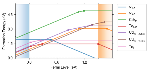
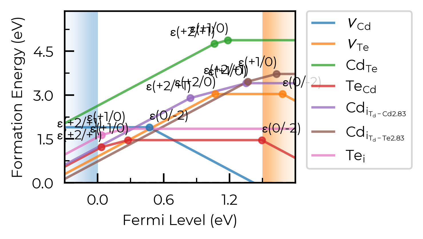
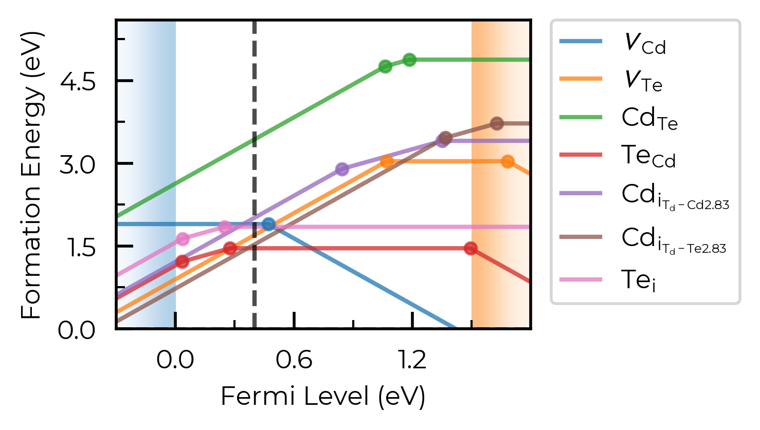
fig = CdTe_thermo.plot(limit="Te-rich") # plot at the Te-rich chemical potential limifig
# run this cell to see the possible arguments for this function (or go to the python API documentation)
CdTe_thermo.plot?
Signature:
CdTe_thermo.plot(
    chempots: dict | None = None,
    limit: str | None = None,
    el_refs: dict | None = None,
    all_entries: bool | str = False,
    unstable_entries: bool | str = 'not shallow',
    defect_subset: list[str] | str | None = None,
    chempot_table: bool | None = None,
    style_file: str | pathlib._local.Path | None = None,
    xlim: tuple | None = None,
    ylim: tuple | None = None,
    fermi_level: float | None = None,
    include_site_info: bool = False,
    colormap: str | matplotlib.colors.Colormap | None = None,
    linestyles: str | list[str] = '-',
    auto_labels: bool = False,
    filename: str | pathlib._local.Path | None = None,
    **kwargs,
) -> matplotlib.figure.Figure | list[matplotlib.figure.Figure]
Docstring:
Produce a defect formation energy vs Fermi level plot (a.k.a. a defect
formation energy / transition level diagram), returning the
``matplotlib`` ``Figure`` object to allow further plot customisation.

Note that the band edge positions are taken from ``self.vbm`` and
``self.band_gap``, which are parsed from the `bulk supercell
calculation` by default, unless ``bulk_band_gap_vr`` is set during
defect parsing.

Note that different defect entries (different charge states, and/or
ground and metastable states (different spin or geometries); e.g.
interstitials at a given site) are grouped together in distinct defect
types according to ``self.dist_tol``, which is also used in transition
level analysis and defect concentrations. This can be adjusted as shown
in the :doc:`plotting customisation tutorial <plotting_customisation_tutorial>`.
See the ``dist_tol`` attribute, ``group_defects_by_distance()`` and
``group_defects_by_type_and_distance()`` functions for more information
on clustering strategies.

Args:
    chempots (dict):
        Dictionary of chemical potentials to use for calculating the
        defect formation energies. If ``None`` (default), will use
        ``self.chempots``. This can have the form of
        ``{"limits": [{'limit': [chempot_dict]}]}`` (the format
        generated by ``doped``\'s chemical potential parsing functions
        (see tutorials)) and specific limits (chemical potential
        limits) can then be chosen using ``limit``.

        Alternatively this can be a dictionary of chemical potentials
        for a single limit, in the format:
        ``{element symbol: chemical potential}``.
        If manually specifying chemical potentials this way, you can
        set the ``el_refs`` option with the DFT reference energies of
        the elemental phases in order to show the formal (relative)
        chemical potentials above the formation energy plot, in which
        case it is the formal chemical potentials (i.e. relative to the
        elemental references) that should be given here, otherwise the
        absolute (DFT) chemical potentials should be given.

        One can also set ``DefectThermodynamics.chempots = ...`` (with
        the same input options) to set the default chemical potentials
        for all calculations.
    limit (str):
        The chemical potential limit for which to plot formation
        energies. Can be either:

        - ``None``, in which case plots are generated for all limits in
          ``chempots``.
        - ``"X-rich"/"X-poor"`` where ``X`` is an element in the
          system, in which case the most X-rich/poor limit will be used
          (e.g. "Li-rich") -- see
          :func:`~doped.chemical_potentials.get_X_rich_poor_limit`.
        - A key in the ``(self.)chempots["limits"]`` dictionary.

        The latter two options can only be used if ``chempots`` is in
        the ``doped`` format (see chemical potentials tutorial).
        (Default: None)
    el_refs (dict):
        Dictionary of elemental reference energies for the chemical
        potentials in the format:
        ``{element symbol: reference energy}`` (to determine the formal
        chemical potentials, when ``chempots`` has been manually
        specified as ``{element symbol: chemical potential}``).
        Unnecessary if ``chempots`` is provided/present in format
        generated by ``doped`` (see tutorials).

        One can also set ``DefectThermodynamics.el_refs = ...`` (with
        the same input options) to set the default elemental reference
        energies for all calculations.
        (Default: None)
    all_entries (bool, str):
        Whether to plot the formation energy lines of `all` defect
        entries, rather than the default of showing only the
        equilibrium states at each Fermi level position (traditional).
        If instead set to ``"faded"``, will plot the equilibrium states
        in bold, and all unstable states in faded grey
        (default: ``False``)
    unstable_entries (bool, str):
        Controls the plotting of unstable/shallow defect states;
        allowed values are ``True``, ``False`` or ``"not shallow"``.
        If ``"not shallow"`` (default), defect entries which are
        predicted to be shallow (perturbed host) states according to
        eigenvalue analysis and only stable for Fermi levels within a
        small window to a band edge (``shallow_stability_tol``) are
        omitted from plotting. If ``False``, `all` defects which are
        not stable for any Fermi level in the band gap are `also`
        omitted from plotting.
        ``shallow_stability_tol`` is set to the smaller of 0.05 eV or
        10% of the band gap by default, but can be set by a
        ``shallow_charge_stability_tolerance = X`` keyword argument. If
        ``unstable_entries=False``, the Fermi window stability
        tolerance for all defects (default = 0; meaning any in-gap
        stability) can be set by a ``charge_stability_tolerance = X``
        keyword argument (positive or negative).
        If ``True``, defect entries are not pruned based on stability /
        shallow classification.
        See ``prune_to_stable_entries`` for more info.
    defect_subset (list[str], str):
        If provided, only defects whose name contains at least one of
        the given substrings are plotted (e.g. ``["v_", "Te_Cd"]``
        would keep all vacancies plus ``Te_Cd``). A bare string is
        treated as a single-element list. (Default: ``None`` -- all
        defects)
    chempot_table (bool | None):
        Whether to include a table of the chemical potentials above the
        formation energy plot. If ``None`` (default), shown if multiple
        plots are generated (i.e. multiple chemical potential limits)
        else not shown.
    style_file (PathLike):
        Path to a ``mplstyle`` file to use for the plot. If ``None``
        (default), uses the default doped style (from
        ``doped/utils/doped.mplstyle``).
    xlim:
        Tuple (min,max) giving the range of the x-axis (Fermi level).
        May want to set manually when including transition level
        labels, to avoid crossing the axes.
        Default is to plot from -0.3 to +0.3 eV above the band gap.
    ylim:
        Tuple (min,max) giving the range for the y-axis (formation
        energy). May want to set manually when including transition
        level labels, to avoid crossing the axes. Default is from 0 to
        just above the maximum formation energy value in the band gap.
    fermi_level (float):
        If set, plots a dashed vertical line at this Fermi level value,
        typically used to indicate the equilibrium Fermi level position
        if known/calculated (e.g. with
        ``get_fermi_level_and_concentrations``). (Default: None)
    include_site_info (bool):
        Whether to include site info in defect names in the plot legend
        (e.g. ``$Cd_{i_{C3v}}^{0}$`` rather than ``$Cd_{i}^{0}$``).
        Default is ``False``, where site info is not included unless we
        have inequivalent sites for the same defect type. If, even with
        site info added, there are duplicate defect names, then
        "-a", "-b", "-c"... are appended to the names to differentiate.
    colormap (str, matplotlib.colors.Colormap):
        Colormap to use for the formation energy lines, either as a
        string (which can be a colormap name from
        https://matplotlib.org/stable/users/explain/colors/colormaps or
        from https://www.fabiocrameri.ch/colourmaps -- append 'S' if
        using a sequential colormap from the latter) or a ``Colormap``
        / ``ListedColormap`` object.
        If ``None`` (default), uses ``tab10`` with ``alpha=0.75`` (if
        10 or fewer lines to plot), ``tab20`` (if 20 or fewer lines) or
        ``batlow`` (if more than 20 lines; citation:
        https://zenodo.org/records/8409685).
    linestyles (list):
        Linestyles to use for the formation energy lines, either as a
        single linestyle (``str``) or list of linestyles
        (``list[str]``) in the order of appearance of lines in the plot
        legend. Default is ``"-"``; i.e. solid lines for all entries.
    auto_labels (bool):
        Whether to automatically label the transition levels with their
        charge states. If there are many transition levels, this can be
        quite ugly. (default: ``False``)
    filename (PathLike): Filename to save the plot to.
    (Default: None (not saved))
    **kwargs:
        Additional keyword arguments for advanced customisation, such
        as ``shallow_charge_stability_tolerance`` or
        ``charge_stability_tolerance`` for controlling stability window
        tolerances with the ``unstable_entries`` parameter (see
        argument description for more info).

Returns:
    ``matplotlib`` ``Figure`` object, or list of ``Figure`` objects if
    multiple limits chosen.
File:      ~/Packages/doped/doped/thermodynamics.py
Type:      method
dist_tol
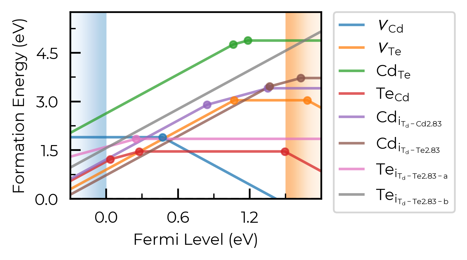
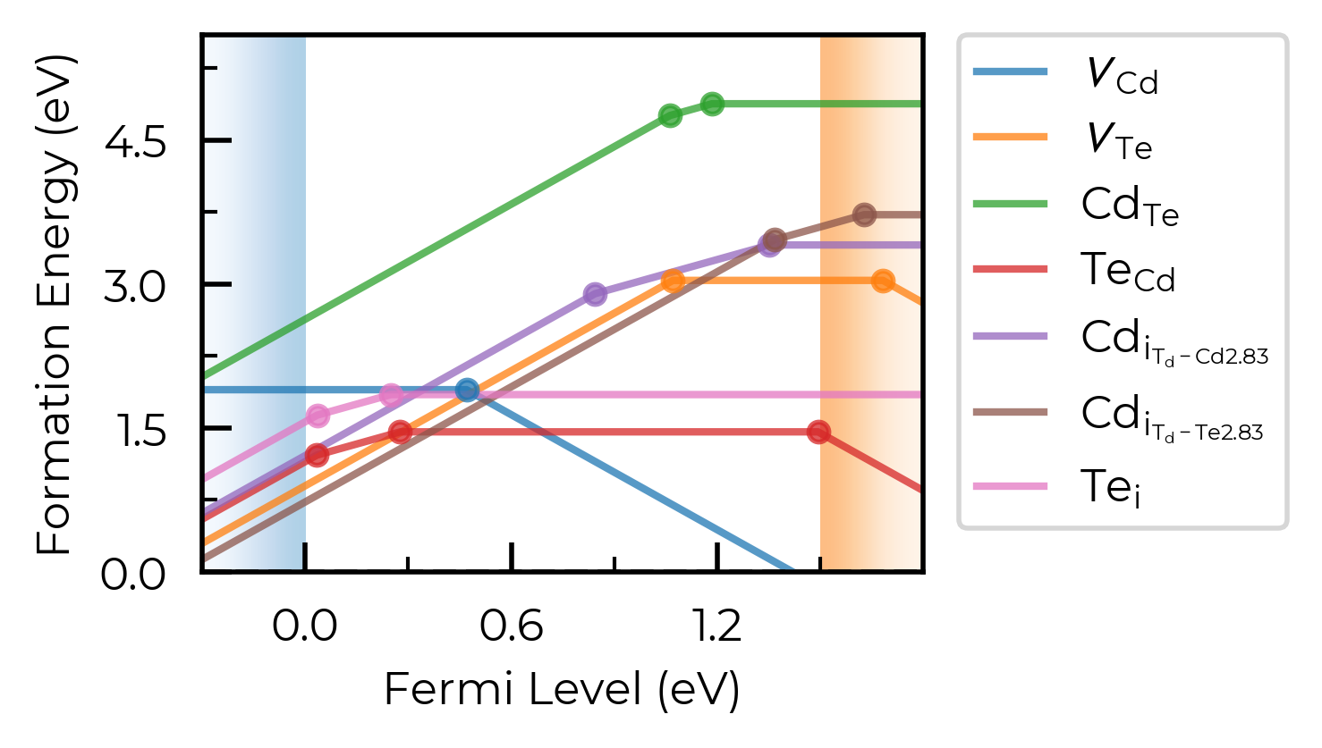
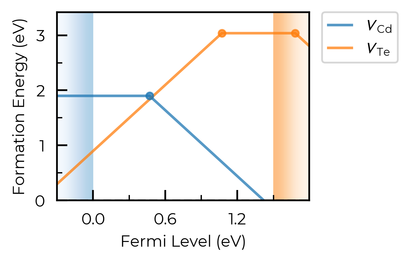
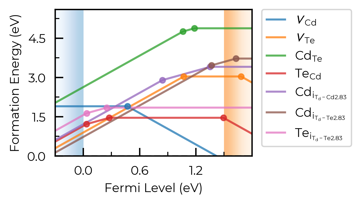
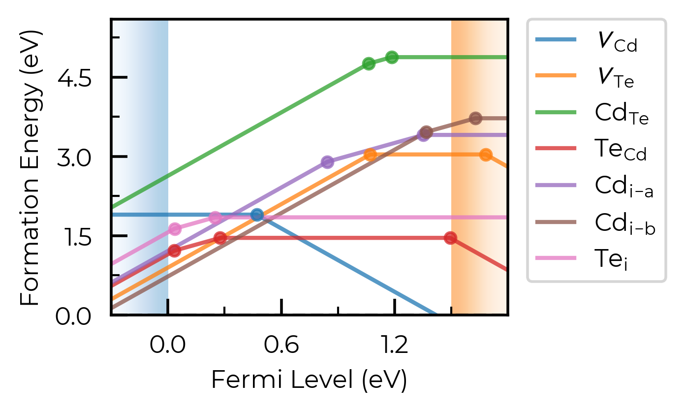
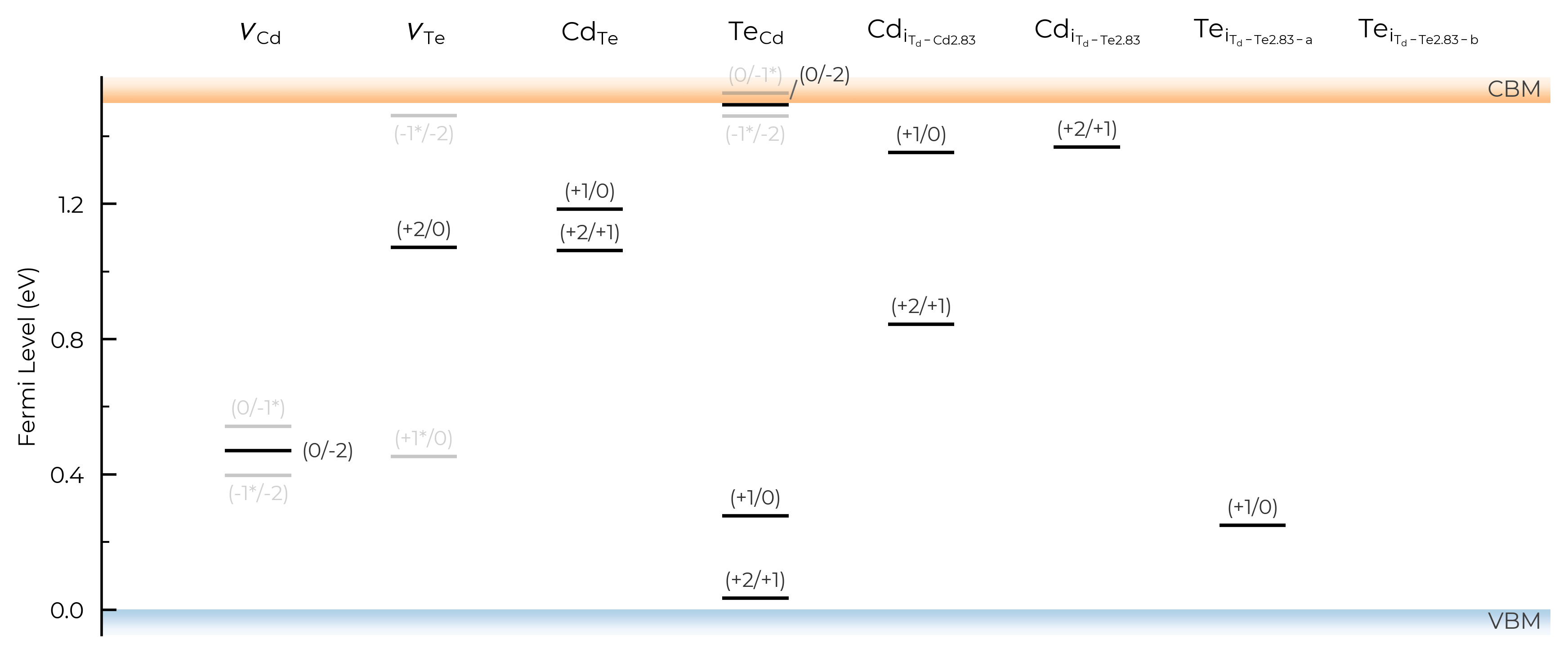
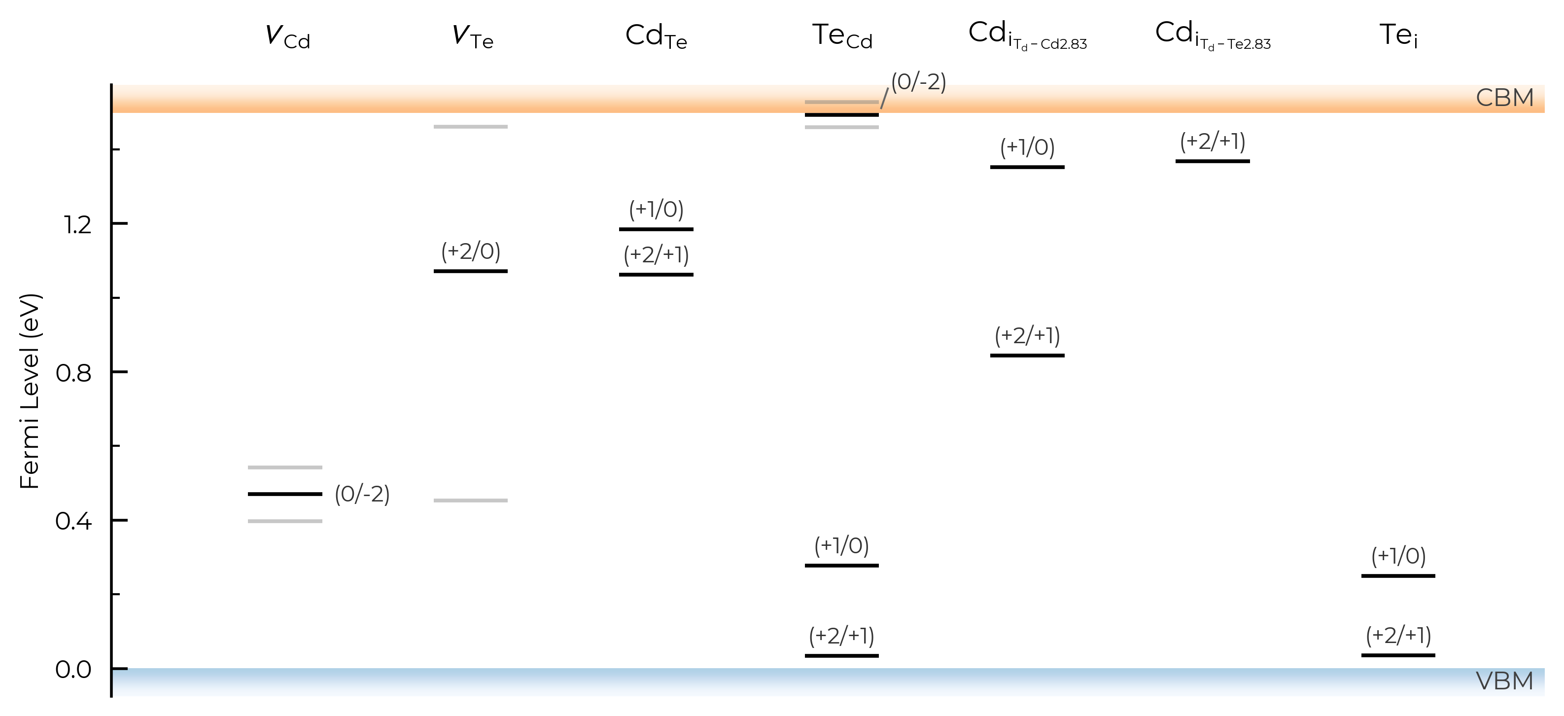
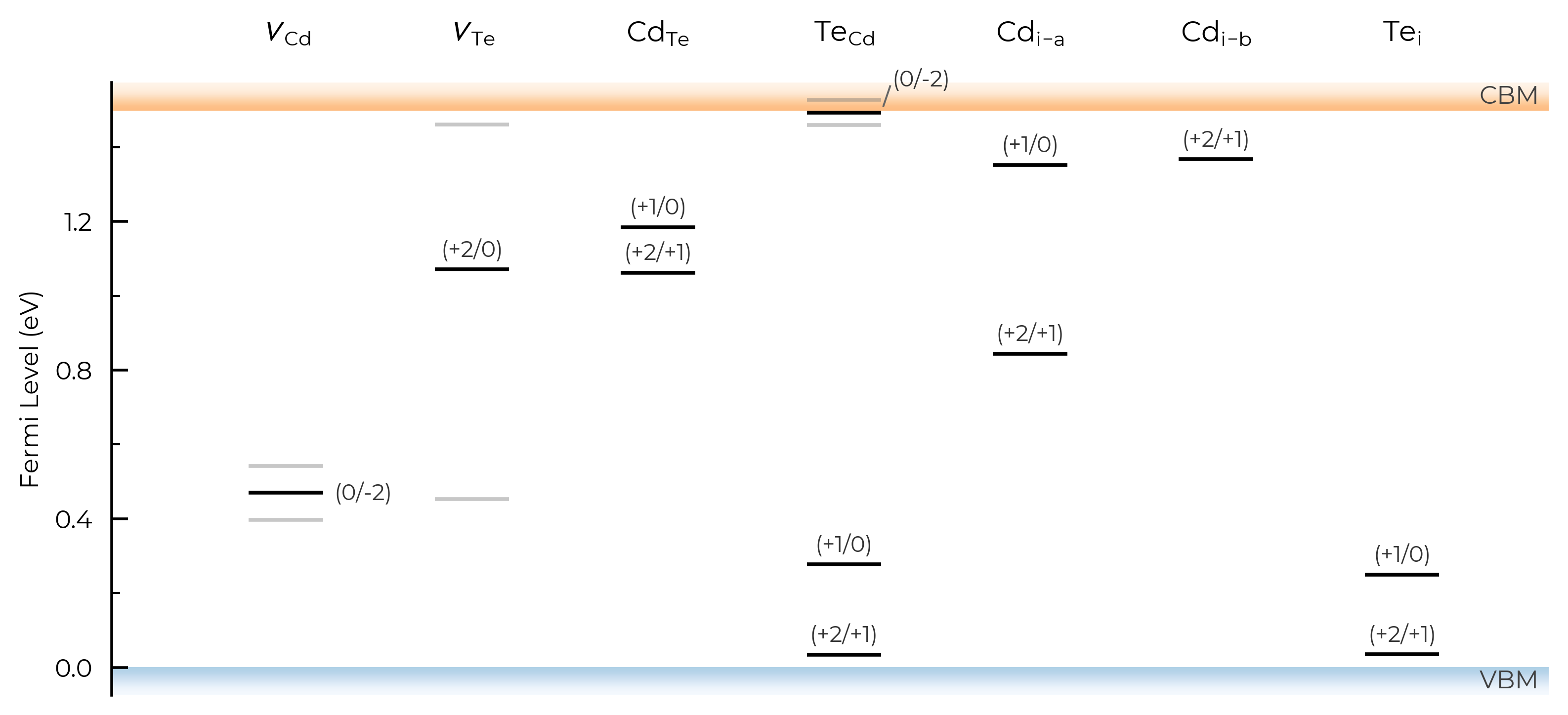
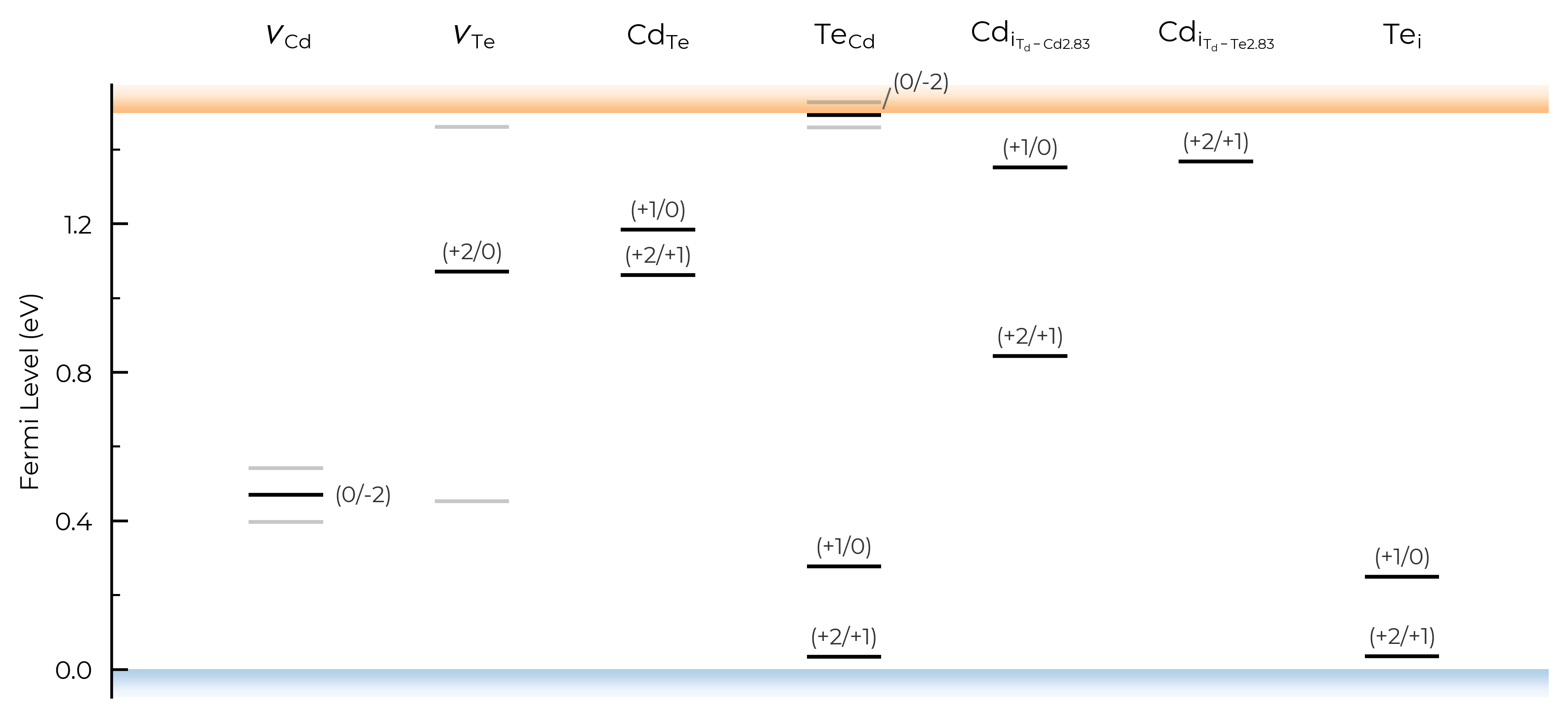
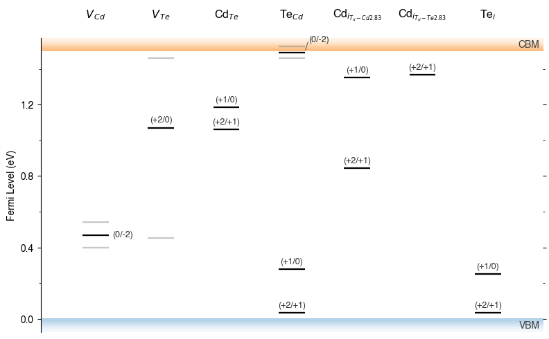
In the above plot, we see doped classified Te interstitials into having two separate defect sites. This is dictated by the dist_tol parameter in DefectThermodynamics (= 1.5 Å by default), which groups together defects which have distances between equivalent defect sites within this tolerance.
In this case, this is because Te interstitials adopt split-interstitial dimer structures for the +1 and neutral charge states, but a different conventional interstitial type structure for the +2 charge state.
We can see this if we use the get_min_dist_between_equiv_sites convenience function:
from doped.utils.symmetry import get_min_dist_between_equiv_sites

dist = get_min_dist_between_equiv_sites(CdTe_thermo["Te_i_Td_Te2.83_+2"], CdTe_thermo["Te_i_Td_Te2.83_0"])
print(f"Distance between Te_i +2 and 0 equivalent sites: {dist:.2f} Å")
Distance between Te_i +2 and 0 equivalent sites: 1.57 Å
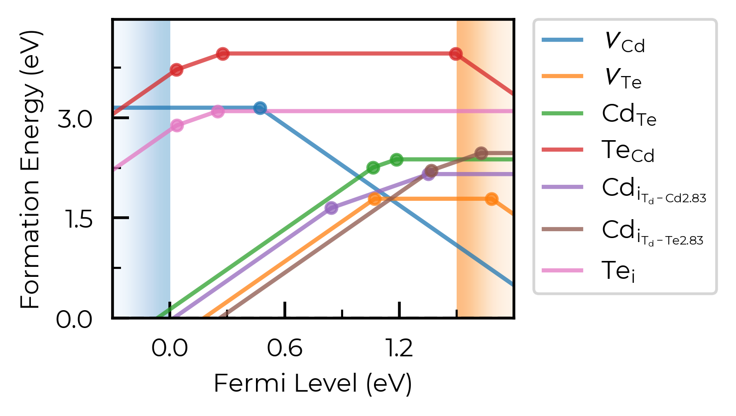
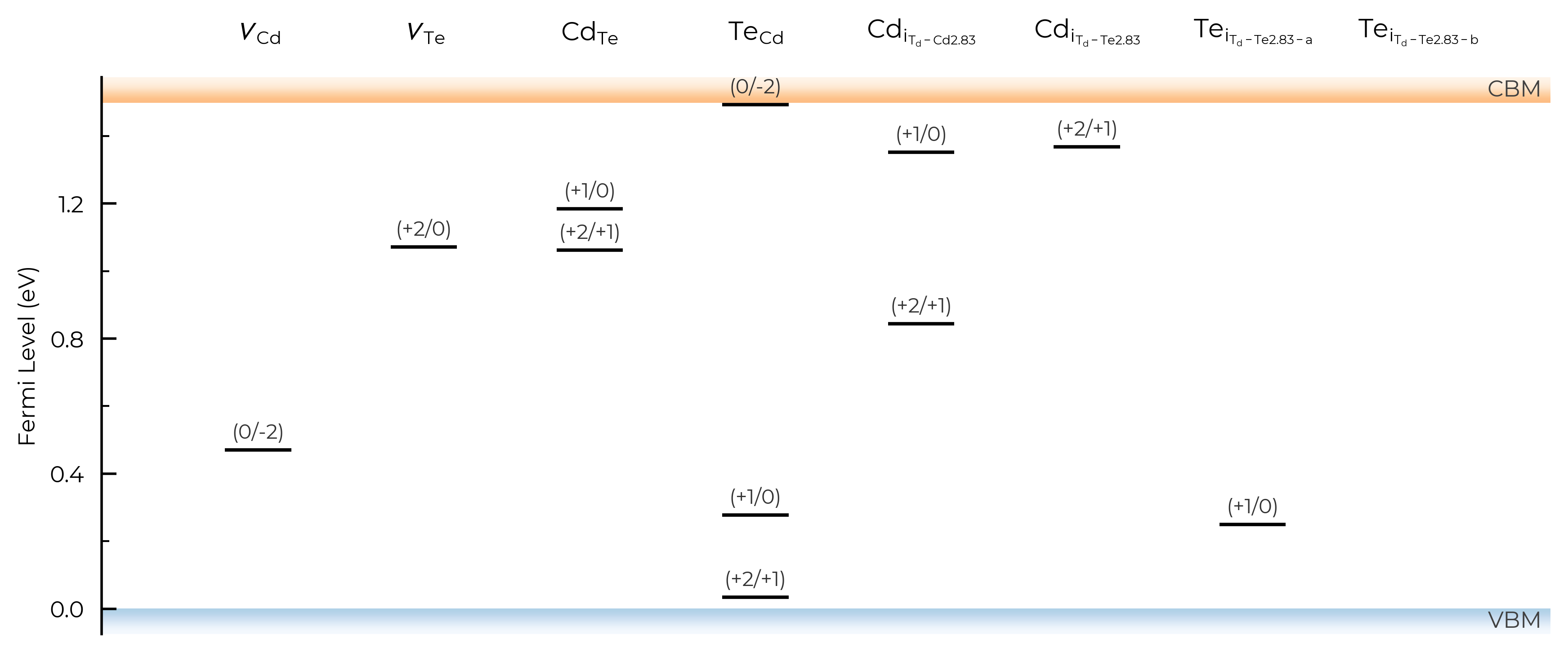
Let’s increase it to 1.6 Å here to group these Te interstitials together:
CdTe_thermo.dist_tol = 1.6
fig = CdTe_thermo.plot(limit="Te-rich")
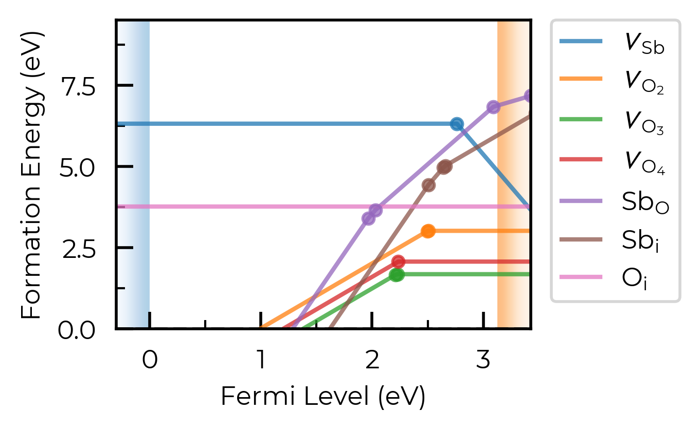
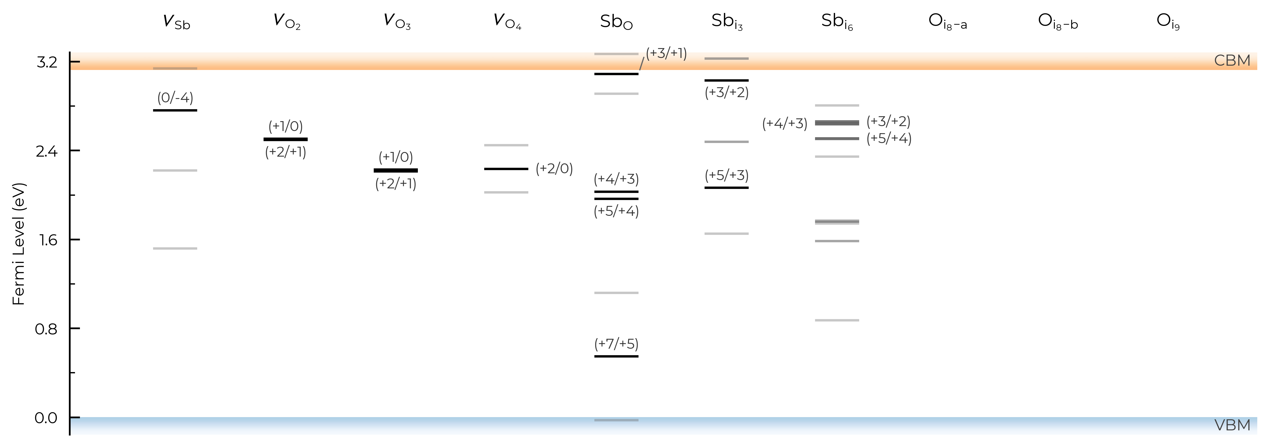
If we had many inequivalent defects in a system (e.g. in low-symmetry/complex systems such as Sb₂Se₃), we can set dist_tol to a high value to merge together these many inequivalent defects so that our formation energy plot just shows the lowest energy species of each defect type. Let’s quickly look at monoclinic Sb₂O₅ (a promising Sb(V)-based transparent conducting oxide, with several inequivalent sites) as an example case of this:
sb2o5_thermo = loadfn("../tests/data/Sb2O5/sb2o5_thermo.json.gz") # load our pre-computed Sb2O5 DefectThermodynamics
fig = sb2o5_thermo.plot(limit="O-poor")
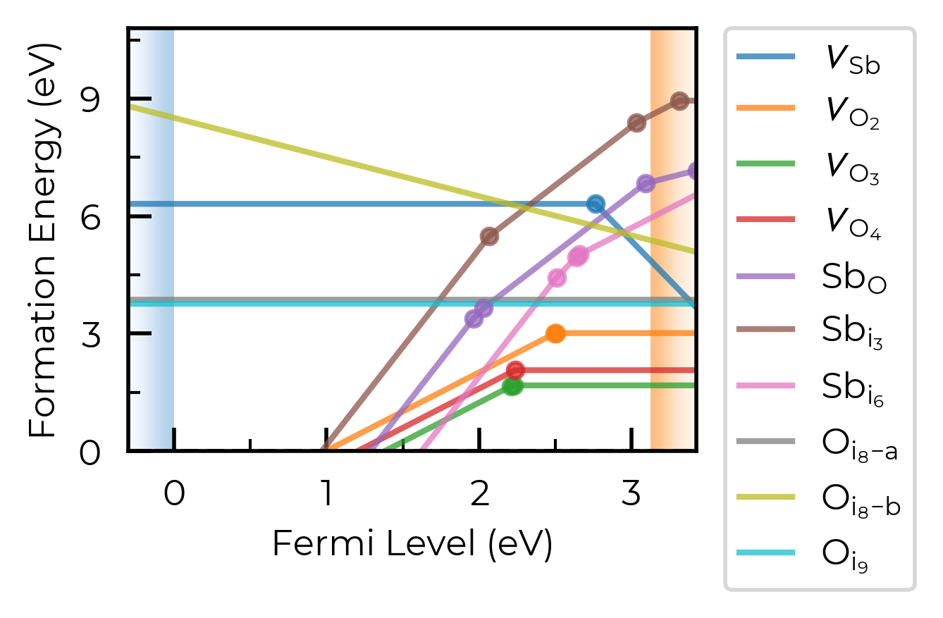
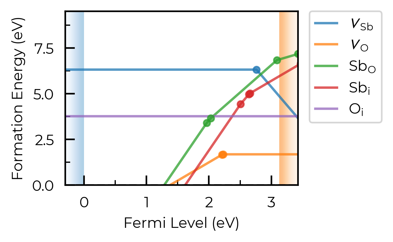
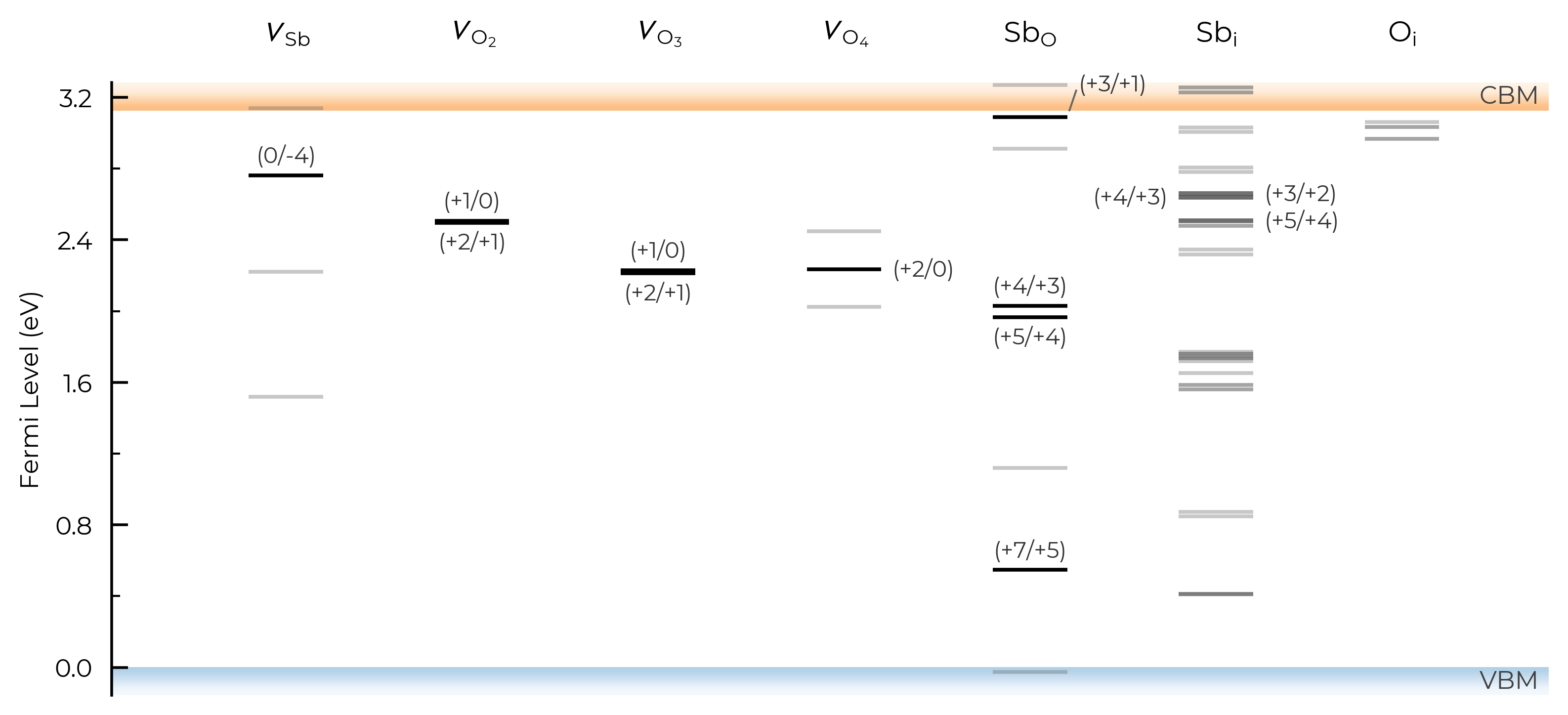
Let’s set dist_tol to 2.5 , which will merge all inequivalent O interstitials and Sb interstitials in this case:
sb2o5_thermo.dist_tol = 2.5
fig = sb2o5_thermo.plot(limit="O-poor")
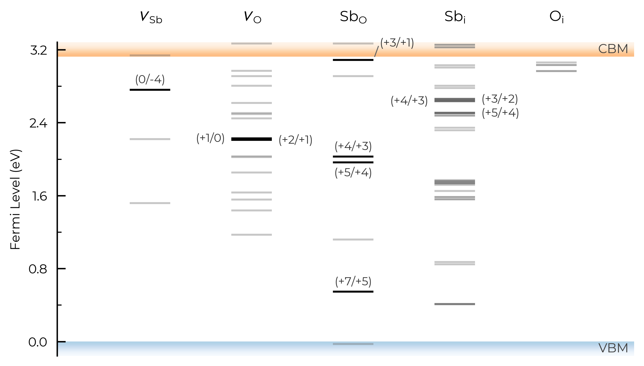
If we set dist_tol even larger, to 3 Å here, this will merge all inequivalent O vacancies as well, so that only the lowest energy states are shown:
sb2o5_thermo.dist_tol = 3
fig = sb2o5_thermo.plot(limit="O-poor")
Note
dist_tol is used to control the grouping together of different defect entries (different charge states, and/or ground and metastable states (different spin or geometries)) which correspond to the same defect type (e.g. interstitials at a given site), which are then used in plotting, transition level analysis and defect concentration calculations; e.g. in the frozen defect approximation, the total concentration of a given defect type group is calculated at the annealing temperature, and then the equilibrium relative population of the constituent entries is recalculated at the quenched temperature.
dist_tol is also used to cluster defects of all types when determining site competition in defect concentration calculations; see e.g. get_fermi_level_and_concentrations docstring.
defect_subset
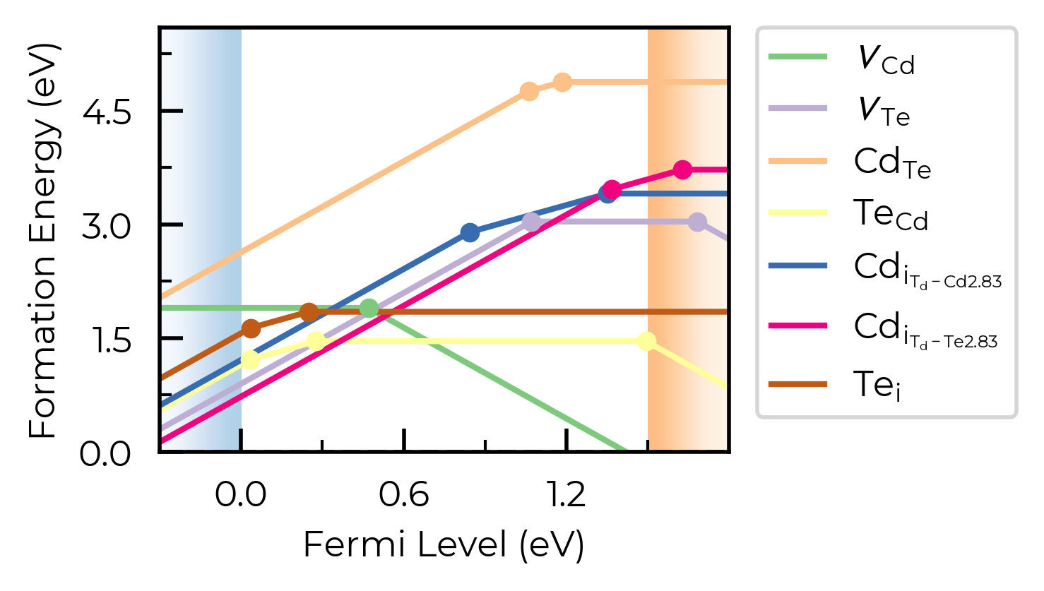
We can use the defect_subset argument to specify a string or list of strings, where only defects whose name contains at least one of the given (sub)strings will be plotted.
For example, let’s plot just the vacancy defects:
fig = CdTe_thermo.plot(limit="Te-rich", defect_subset="v_") # 'v_' to match vacancies
Alternatively, we could achieve the same result by manually creating a vacancies-only DefectThermodynamics object:
from doped.thermodynamics import DefectThermodynamics

vacancies_only_thermo = DefectThermodynamics(
    [entry for name, entry in CdTe_thermo.defect_entries.items() if "v_" in name],
    chempots=CdTe_thermo.chempots,
)
fig = vacancies_only_thermo.plot(limit="Te-rich")
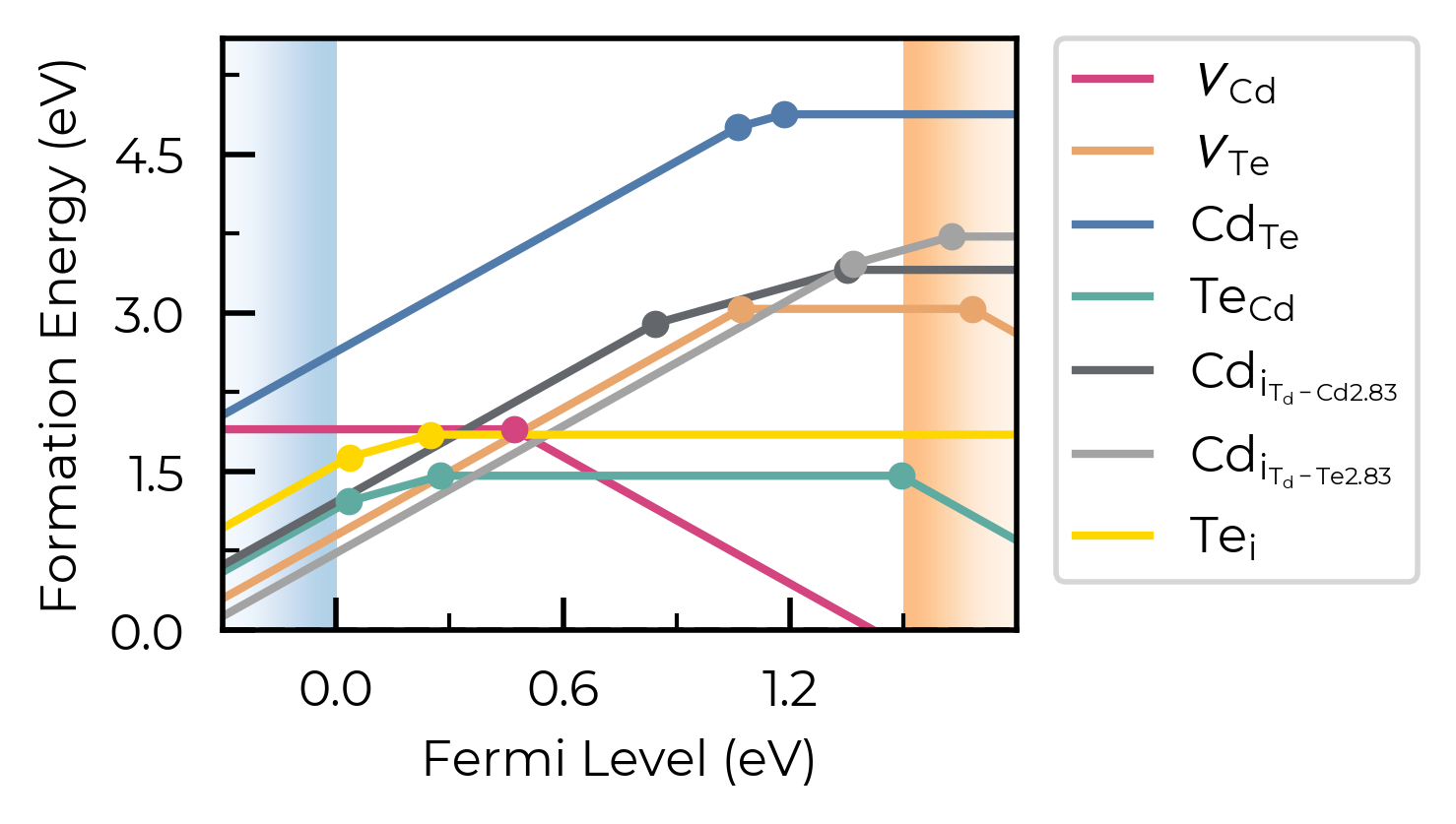
all_entries
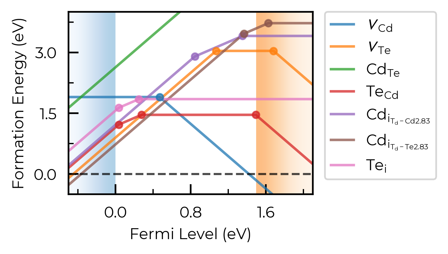
We can set all_entries = True to show the full formation energy lines for all defect species, not just the lowest energy charge states. This can be useful for analysing metastable defect states, but can also be quite messy when we are plotting many defects at once.
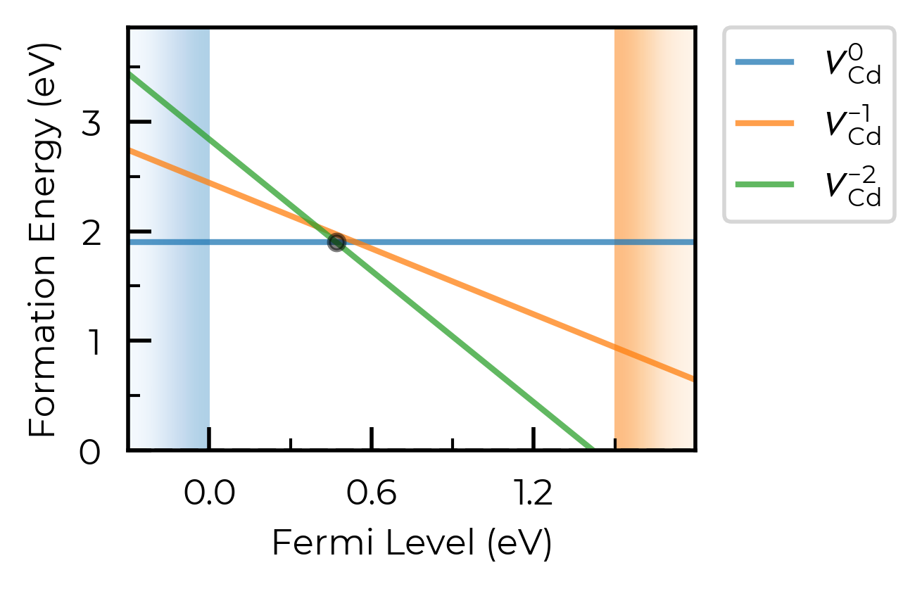
For this case, let’s plot just the Cd vacancy defects:
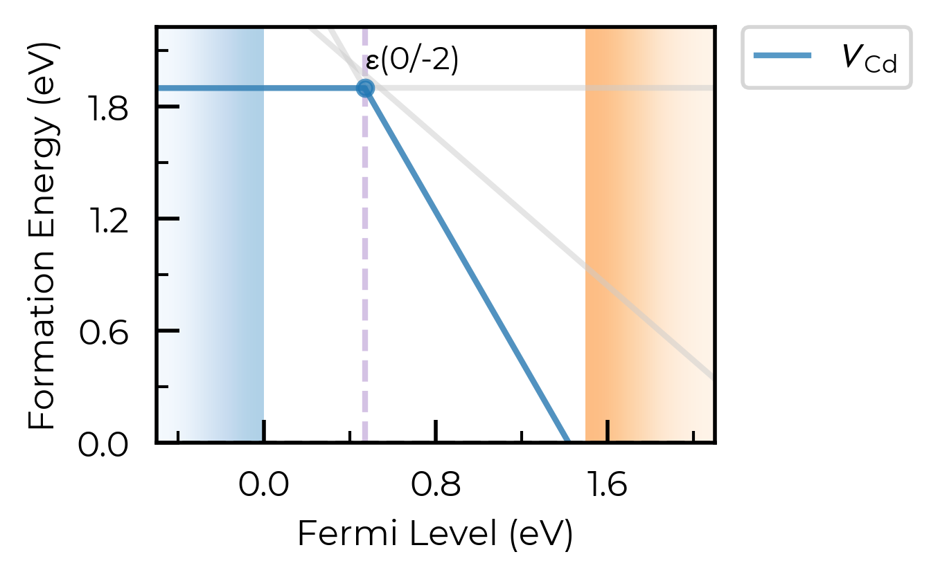
fig = CdTe_thermo.plot(all_entries=True, limit="Te-rich", defect_subset="v_Cd")
We can instead set all_entries = "faded" to show the full formation energy lines for all defect species, but with all metastable states faded out in grey:
fig = CdTe_thermo.plot(
    auto_labels=True,
    xlim=(-0.5, 2.1),
    all_entries="faded",
    limit="Te-rich",
    defect_subset="v_Cd"
)
ax = fig.gca()
ax.axvline(0.47, ls="--", c="C4", alpha=0.4, zorder=-1)  # add a vertical line at the transition level
<matplotlib.lines.Line2D at 0x11bfb0b90>
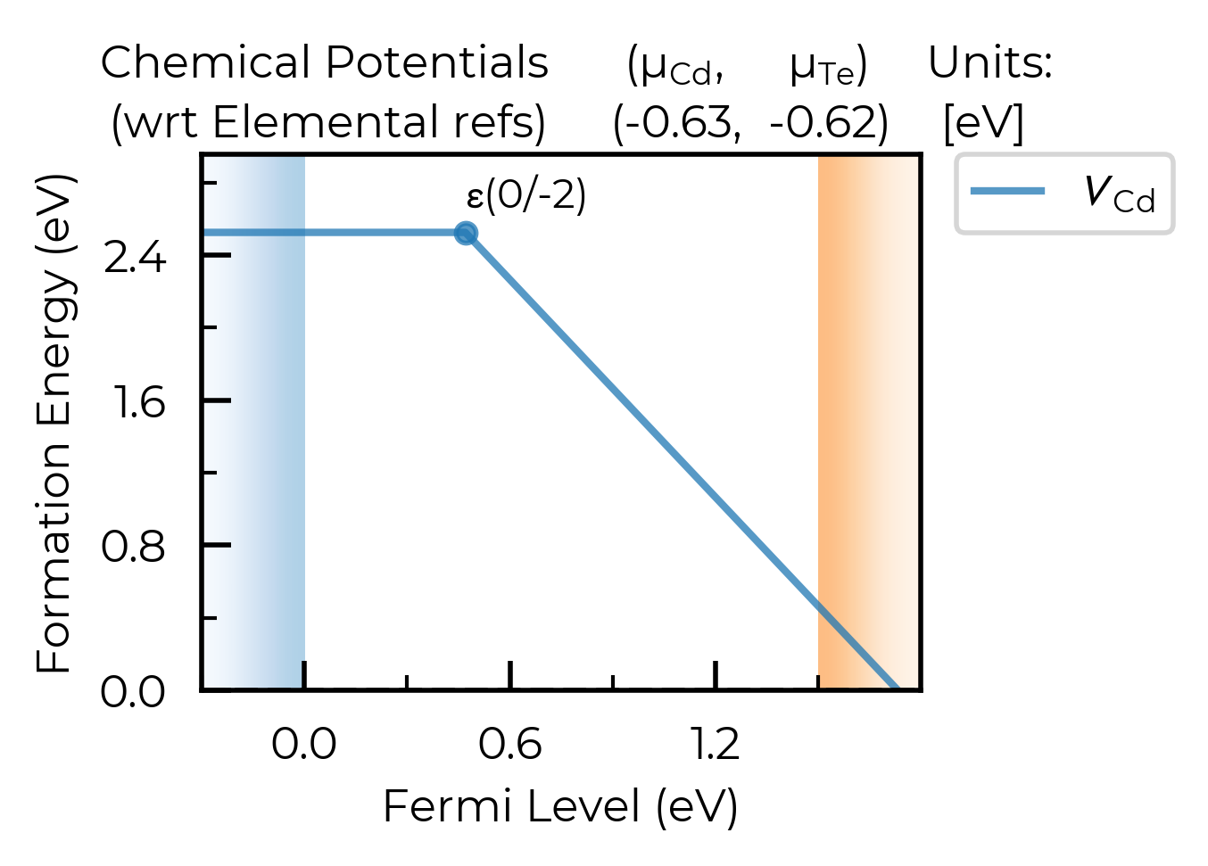
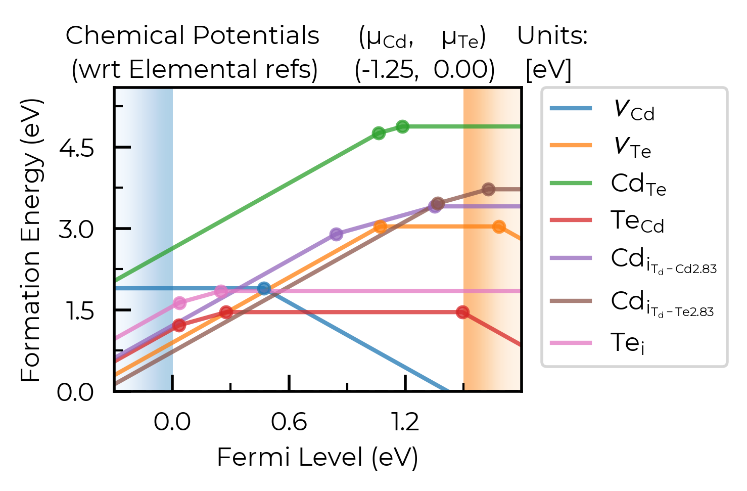
chempots & el_refs
We can also set the chemical potentials to be used in the plot directly in the plotting function (or can of course adjust DefectThermodynamics.chempots/el_refs directly):
# we can always set/overwrite `chempots` in the plotting/tabulation functions like this too:
fig = CdTe_thermo.plot(
    chempots={"Cd": -0.6255, "Te": -0.625},  # midpoint between Te/Cd-rich
    el_refs=CdTe_thermo.chempots.get("elemental_refs"),
    auto_labels=True,
    chempot_table=True,  # set this to True to show the chempots being used!
    defect_subset="v_Cd"
)
limit
The limit parameter specifies the chemical potential limit for which to
plot formation energies. This can be either:
None, in which case plots are generated for all limits inchempots.“X-rich”/”X-poor” where X is an element in the system, in which case the most X-rich/poor limit will be used (e.g. “Li-rich”).
A key in the
(DefectThermodynamics.)chempots["limits"]dictionary.
The latter two options can only be used if chempots is in the doped format (see chemical potentials tutorial).
# print the chemical potential limits
print(CdTe_thermo.chempots["limits"].keys())
dict_keys(['Cd-CdTe', 'CdTe-Te'])
In this case, we can plot the Cd-rich limit by setting limit="Cd-rich", limit="Cd-CdTe" (the Cd-rich limit here) or by just manually setting the chemical potentials to this limit:
fig = CdTe_thermo.plot(limit="Cd-CdTe", chempot_table=True)
# manual Cd-rich chempots:
fig = CdTe_thermo.plot(
    chempots=CdTe_thermo.chempots["limits_wrt_el_refs"]["Cd-CdTe"],
    el_refs=CdTe_thermo.chempots["elemental_refs"]
)
unstable_entries
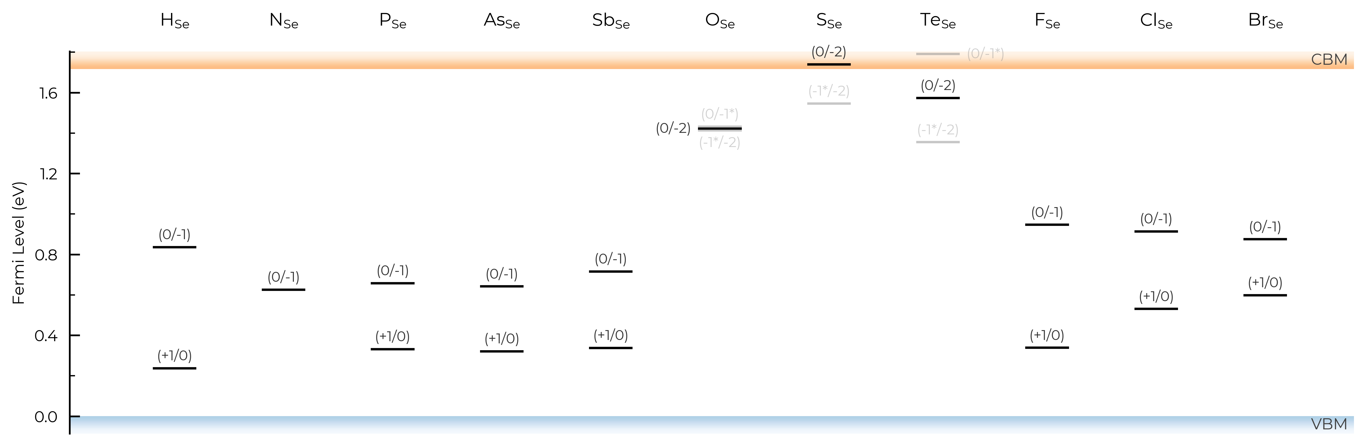
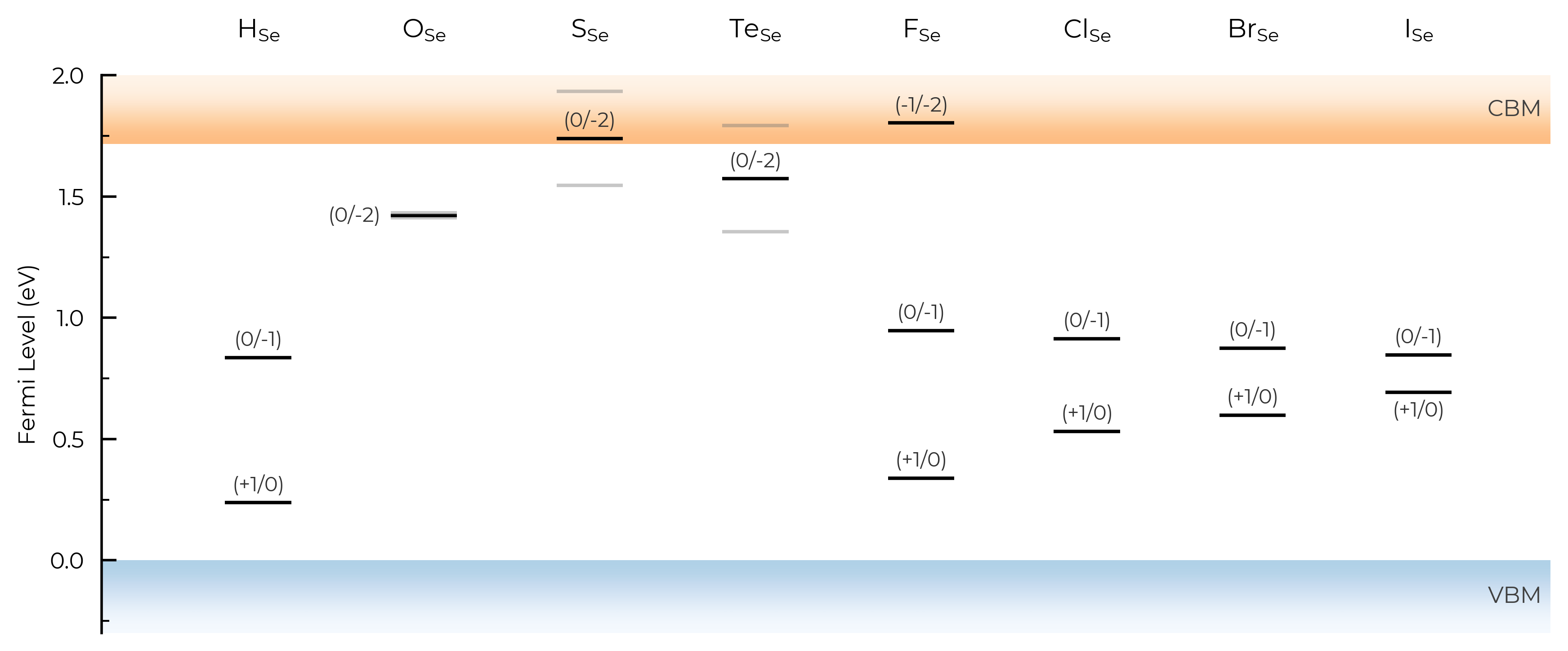
We can use the unstable_entries argument to control the plotting or omission of shallow (‘perturbed host’) and unstable defect charge states. See the Electronic Structure Analysis section of the doped Tips page for more info on shallow defect states.
The default setting is unstable_entries = "not shallow", meaning entries which are
detected to be shallow (‘perturbed host’) states and unstable for Fermi levels in the band gap are omitted from plotting for clarity & accuracy.
from doped.thermodynamics import DefectThermodynamics
Se_extrinsic_thermo = DefectThermodynamics.from_json( # load our DefectThermodynamics object
"../tests/data/Se_Ext_No_Pnict_Thermo.json.gz")
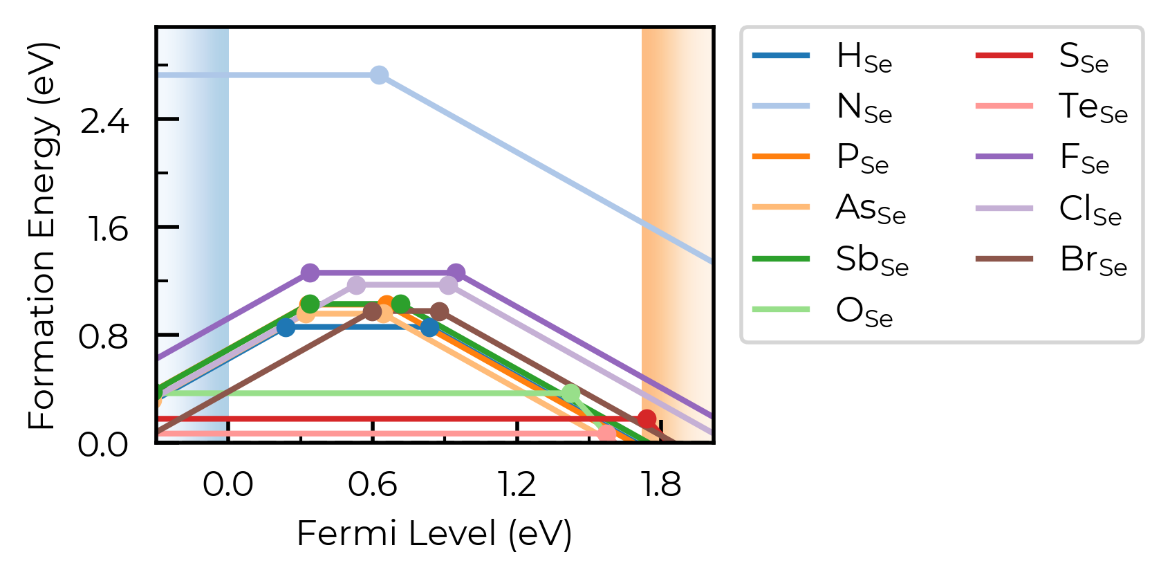
fig = Se_extrinsic_thermo.plot(unstable_entries=True) # no pruning of shallow/unstable states
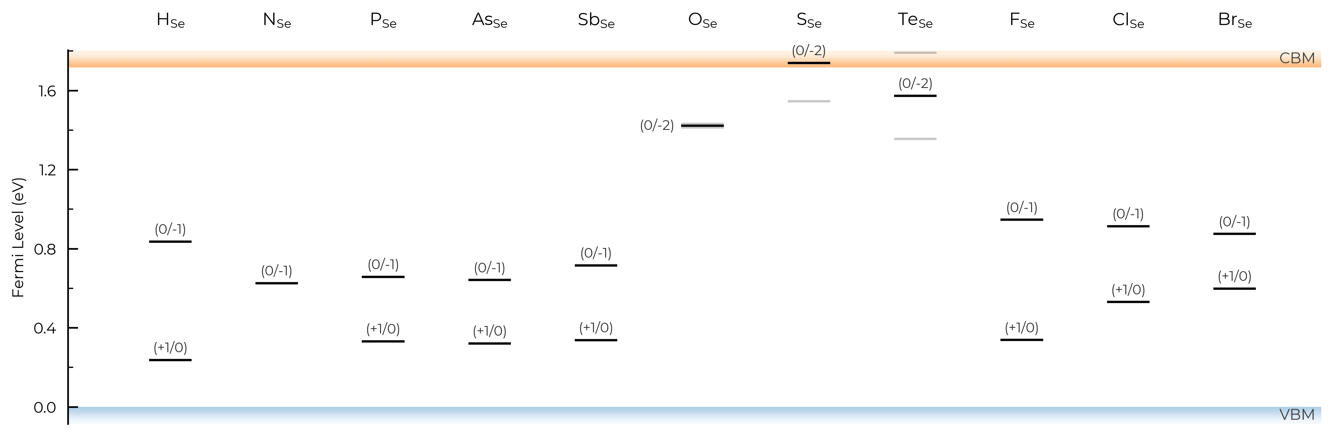
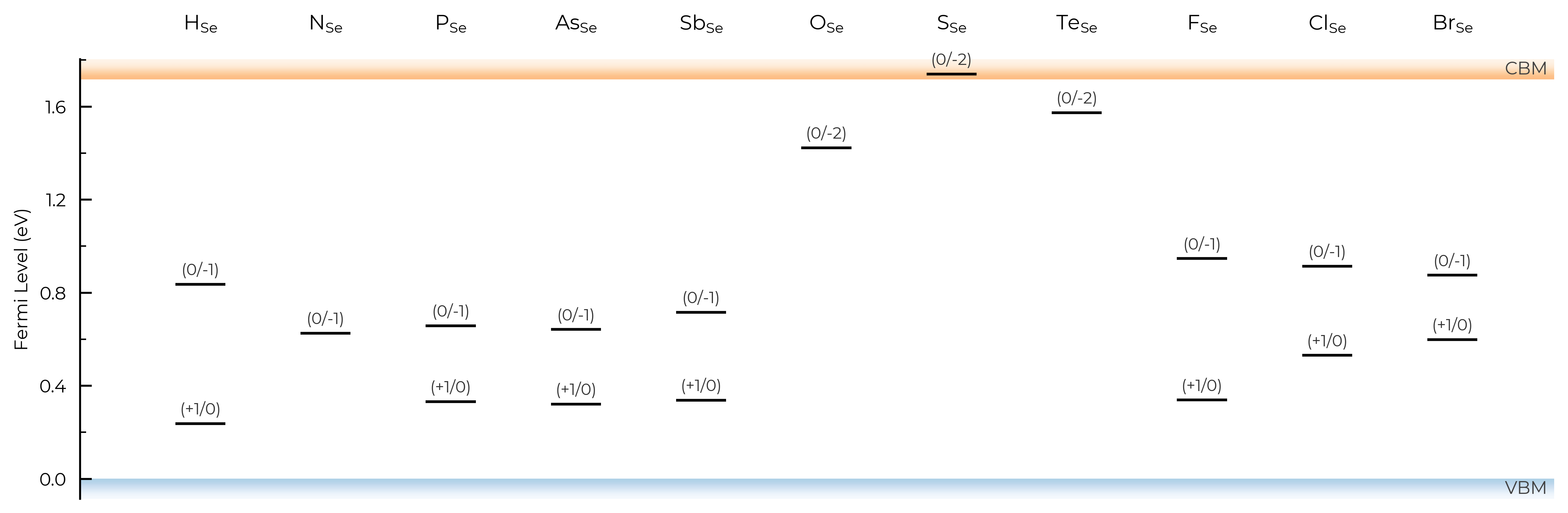
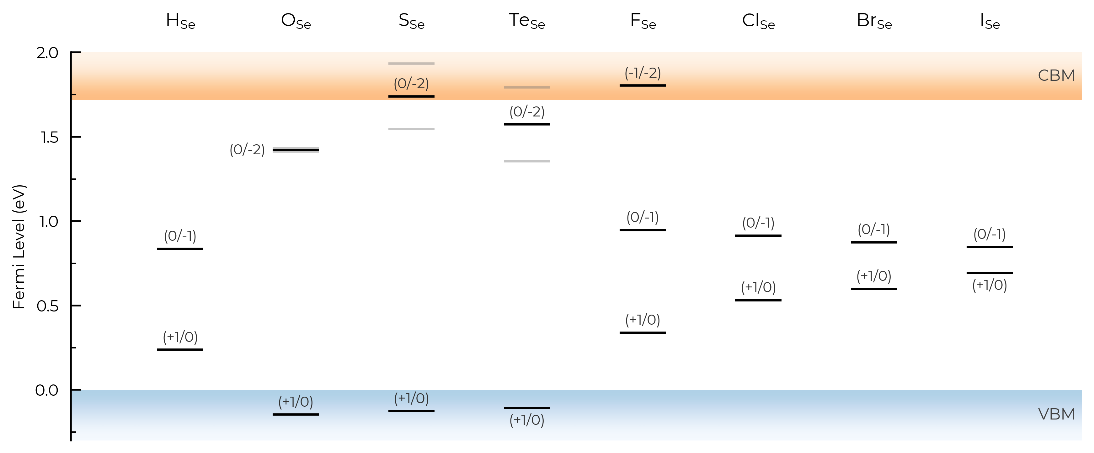
We can see with the default unstable_entries="not shallow" below here, some +1 charge states for chalcogen substitutions/interstitials (from this paper on defects in Selenium) are now omitted, being unstable for in-gap Fermi levels and having been automatically detected as shallow defects by doped’s eigenvalue analysis:
fig = Se_extrinsic_thermo.plot(unstable_entries="not shallow") # default
Se_extrinsic_thermo["sub_1_O_on_Se_1"].is_shallow # confirm shallow classification
True
See the API docs / docstring for more info on the available unstable_entries choices!
include_site_info
The include_site_info argument controls the use of defect site information in the defect names (i.e. legend in the formation energy plots). The default setting (None) omits site info unless needed to disambiguate distinct (grouped) defects:
# show site info in all cases where available (interstitial defects here):
fig = CdTe_thermo.plot(limit="Te-rich", include_site_info=True)
# don't show site info -- here the labels "Cd_i-a" and "Cd_i-b" are used to differentiate instead, while "Te_i" needs no additional labelling to disambiguate:
fig = CdTe_thermo.plot(limit="Te-rich", include_site_info=False)
colormap
We can set different (qualitative) colour maps for the plots. This can be a string name of a Matplotlib colormap (see here), or a Colormap object:
fig = CdTe_thermo.plot(limit="Te-rich", colormap="Accent")
from matplotlib.colors import ListedColormap

custom_cmap = ListedColormap(["#D4447E", "#E9A66C", "#507BAA", "#5FABA2", "#63666A", "#A3A3A3", "#FFD700"])
fig = CdTe_thermo.plot(limit="Te-rich", colormap=custom_cmap)
linestyles (and dist_tol, colormap)
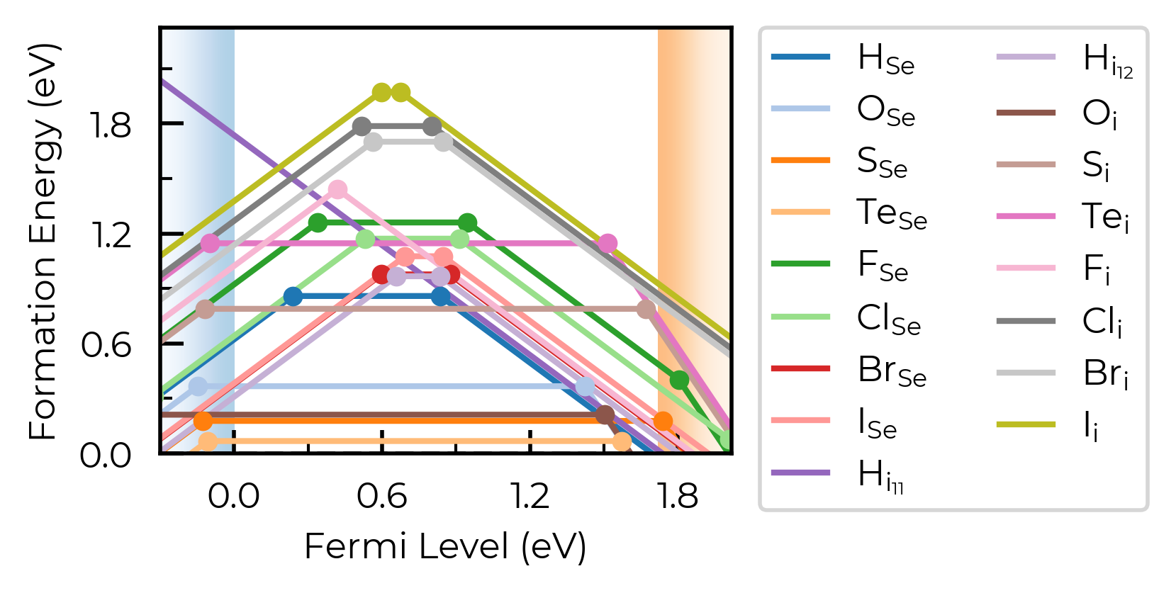
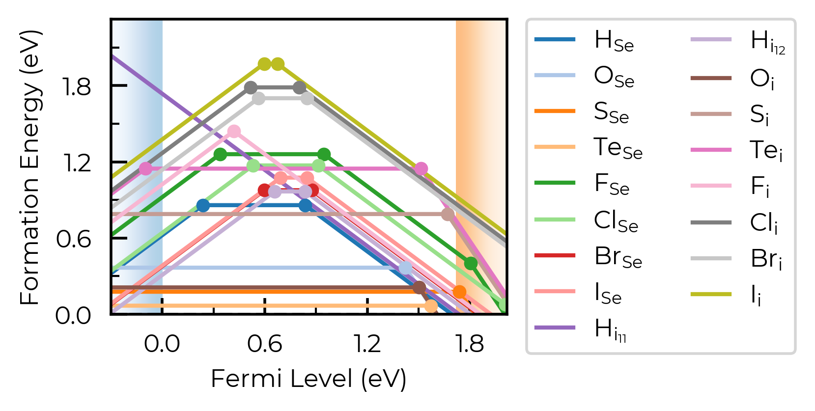
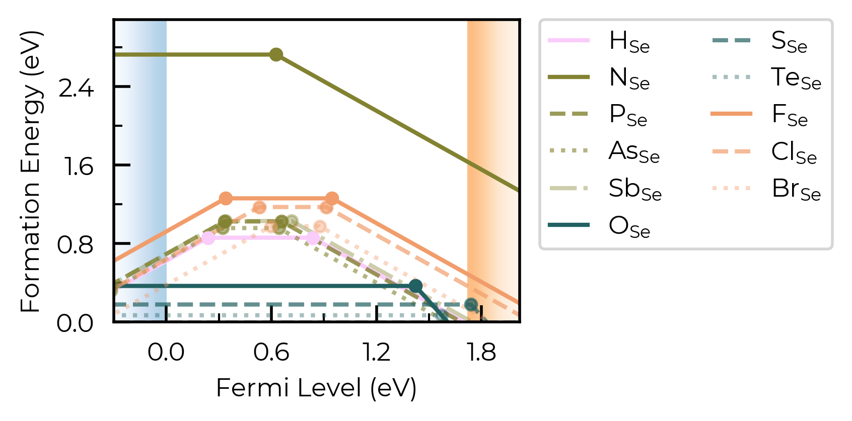
In this example, we plot the formation energies of impurity elements as interstitials in trigonal Selenium – a promising candidate for indoor and tandem PV, investigated using doped & ShakeNBreak:
from doped.thermodynamics import DefectThermodynamics
Se_extrinsic_thermo = DefectThermodynamics.from_json(
    "Se/Se_Amalgamated_Extrinsic_Thermo.json.gz"
)  # load our DefectThermodynamics object
# interstitials only first:
from doped.core import Interstitial
Se_extrinsic_interstitials_thermo = DefectThermodynamics(
    defect_entries=[entry for entry in Se_extrinsic_thermo.defect_entries.values()
                    if isinstance(entry.defect, Interstitial)],
    chempots = Se_extrinsic_thermo.chempots,
)
fig = Se_extrinsic_interstitials_thermo.plot()
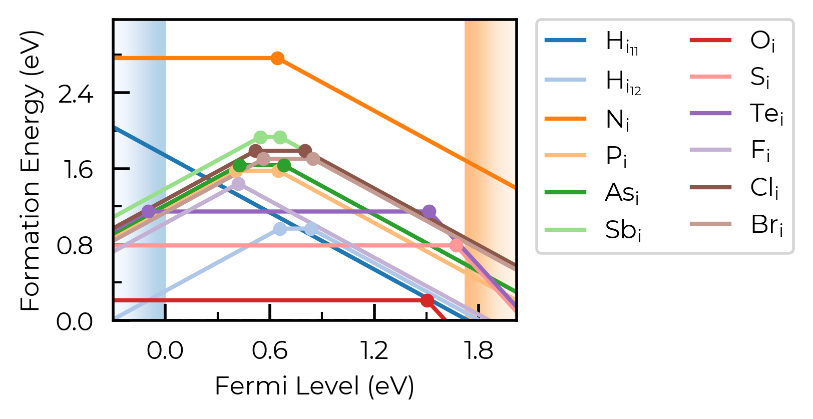
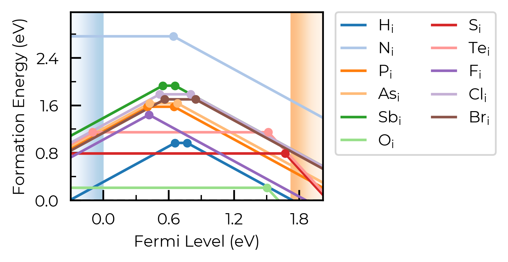
Here, we have two nearby-but-distinct interstitial sites for hydrogen interstitials. For now, let’s increase dist_tol to merge these together, and just show the lowest energy state for each distinct defect type:
Se_extrinsic_interstitials_thermo.dist_tol = 2
fig = Se_extrinsic_interstitials_thermo.plot()
from doped.core import Substitution
Se_extrinsic_substitutions_thermo = DefectThermodynamics(
    defect_entries=[entry for entry in Se_extrinsic_thermo.defect_entries.values()
                    if isinstance(entry.defect, Substitution)],
    chempots = Se_extrinsic_thermo.chempots,
)
fig = Se_extrinsic_substitutions_thermo.plot()
Here, we have a number of consistent trends in behaviour for the impurities, as a function of periodic group and row (hydrogen vs pnictogens vs chalcogens vs halogens), so it would aid our analysis to group the defects together in this way. We can use the colormap and linestyles option to do this:
Tip
By default, defect entries in DefectThermodynamics.defect_entries (and thus plotting) are ordered by defect type (vacancies, substitutions, interstitials), then by order of appearance of the elements in the host composition, then by periodic group, then by atomic number (and then by charge state).
This is seen above, where the defects are ordered: H (group 1), N, P, As, Sb (group 15, descending), O, S, Te (group 16, descending), F, Cl, Br (group 17, descending). This makes plotting customisation based on periodic table positioning nice and easy, as shown below.
# order of defects in plot: H, N, P, As, Sb, O, S, Te, F, Cl, Br
from matplotlib.colors import ListedColormap
import cmcrameri.cm as cmc

# choose our colours for each periodic group:
colors = cmc.cmaps.get("batlowS").colors  # choose colormap (www.fabiocrameri.ch/colourmaps)
H_color, pnict_color, chalc_color, halogen_color = colors[1:5]  # choose colors
H_pnict_chalc_halogen_colormap = ListedColormap(
    [
        H_color,  # RGB color
        # here we also adjust the alpha value to decrease the opacity of each line as we
        # move down the periodic group:
        *[(*pnict_color, 1 - 0.2 * i) for i in range(4)],  # RGBA color (RGB + alpha)
        *[(*chalc_color, 1 - 0.3 * i) for i in range(3)],
        *[(*halogen_color, 1 - 0.3 * i) for i in range(3)],
    ]
)
# choose linestyles
linestyles = [  # solid for first of each group, then dashed, dotted, dashdot
    "-",
    "-",
    "--",
    ":",
    "-.",
    "-",
    "--",
    ":",
    "-",
    "--",
    ":",
]

fig = Se_extrinsic_interstitials_thermo.plot(
    colormap=H_pnict_chalc_halogen_colormap,
    linestyles=linestyles,
)
Cool. Let’s plot the substitutions like this too:
from doped.core import Substitution

Se_extrinsic_substitutions_thermo = DefectThermodynamics(
    defect_entries=[
        entry
        for entry in Se_extrinsic_thermo.defect_entries.values()
        if isinstance(entry.defect, Substitution)
    ],
    chempots=Se_extrinsic_thermo.chempots,
)
fig = Se_extrinsic_substitutions_thermo.plot(
    colormap=H_pnict_chalc_halogen_colormap,
    linestyles=linestyles,
)  # same number of defects to plot, so can use same colormap and linestyles
style_file
We can adjust the overall style of the plot by using a custom matplotlib style (mplstyle) file:
with open("custom_style.mplstyle", "w") as f:
    f.write("ytick.right : True\nxtick.top : True\nfont.sans-serif : Helvetica")
fig = CdTe_thermo.plot(limit="Te-rich", style_file="custom_style.mplstyle")
auto_labels
We can include automatic labels for the transition levels: (as you can see, these get very messy when we are plotting many defects, so usually best to use only with a small number of defects)
fig = CdTe_thermo.plot(limit="Te-rich", auto_labels=True)
chempot_table
We can control whether or not to show the chemical potentials above the plot, which can be useful when looking at behaviour under different chemical potential limits:
fig = CdTe_thermo.plot(limit="Te-rich", chempot_table=True)
xlim & ylim
We can adjust the axis limits:
fig = CdTe_thermo.plot(limit="Te-rich", xlim=(-0.5, 2.1), ylim=(-0.5, 4.0))
fermi_level / Editing Output Figure
We can show a vertical line at the predicted Fermi level position (see the doped thermodynamics tutorial for details on how we might go about doing this):
fig = CdTe_thermo.plot(limit="Te-rich", fermi_level=0.4)
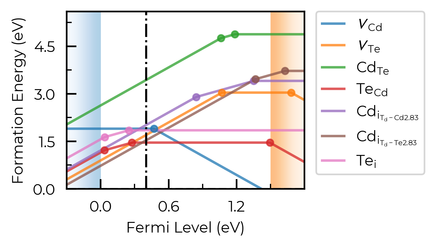
The same effect can be achieved by manually editing the output matplotlib Figure:
fig = CdTe_thermo.plot(limit="Te-rich")
fig.gca().axvline(0.4, c="k", linestyle="--", alpha=0.7)
<matplotlib.lines.Line2D at 0x4df6be350>
Tip
All doped plotting functions return the matplotlib Figure as part of the outputs, allowing you to further edit and customise the plot as desired.
filename
We can set filename to save the plot to file:
fig = CdTe_thermo.plot(limit="Te-rich", filename="CdTe_defects_plot.png")
Defect Transition Level Plotting
We can use the plot_transition_levels() method of DefectThermodynamics to plot a vertical energy level / band diagram of the charge transition levels for defects in our system, with similar plotting options and functionality to DefectThermodynamics.plot() and DefectThermodynamics.get_transition_levels().
See Kawashima & Botti arXiv 2026 and Wang et al. ACS Energy Lett 2024 for nice examples.
%matplotlib inline
from monty.serialization import loadfn
from doped.thermodynamics import DefectThermodynamics
from doped.core import Substitution

CdTe_thermo = loadfn("CdTe/CdTe_thermo_wout_meta.json.gz")  # load our DefectThermodynamics object
Se_extrinsic_thermo = DefectThermodynamics.from_json(
    "Se/Se_Amalgamated_Extrinsic_Thermo.json.gz"
)  # load our DefectThermodynamics object
Se_extrinsic_substitutions_thermo = DefectThermodynamics(
    defect_entries=[entry for entry in Se_extrinsic_thermo.defect_entries.values()
                    if isinstance(entry.defect, Substitution)],
    chempots = Se_extrinsic_thermo.chempots,
)
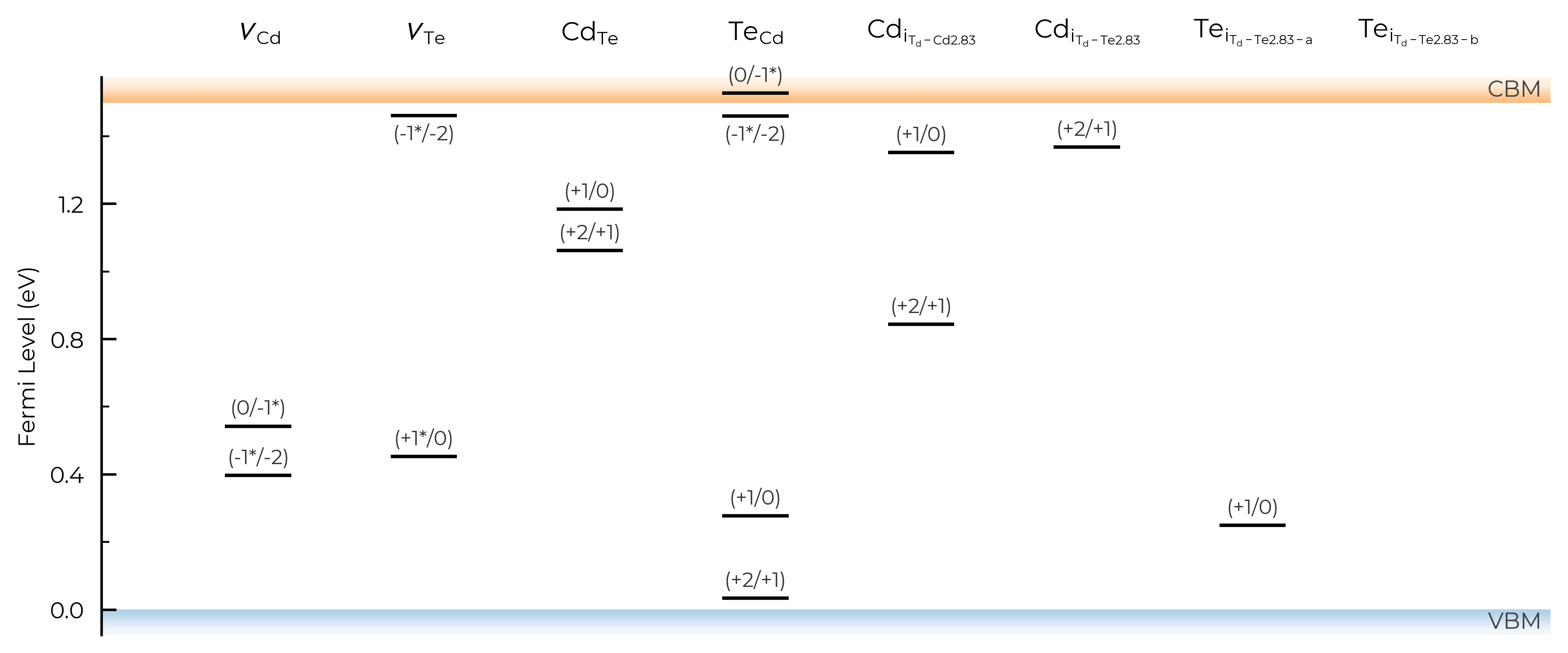
TL_plot = CdTe_thermo.plot_transition_levels()

TL_plot = Se_extrinsic_substitutions_thermo.plot_transition_levels()
Tip
DefectThermodynamics.plot_transition_level() uses an intelligent dynamic label placement algorithm to try and label each of the charge transition levels without having overlapping labels/lines. However, in some edge cases (e.g. with many bunched transition levels, metastable charge states etc.) this can still fail, in which case we advise saving to PDF/SVG/other vector graphic file, and manually editing (for publication-ready figures).
# run this cell to see the possible arguments for this function (or go to the python API documentation)
CdTe_thermo.plot_transition_levels?
all
As with DefectThermodynamics.get_transition_levels and DefectThermodynamics.print_transition_levels, we can use the all keyword argument to control the appearance of transition levels involving metastable charge states. The default is all="faded", where all transition levels (TLs) are shown, but metastable-containing TLs are shown faded without labels (as seen above).
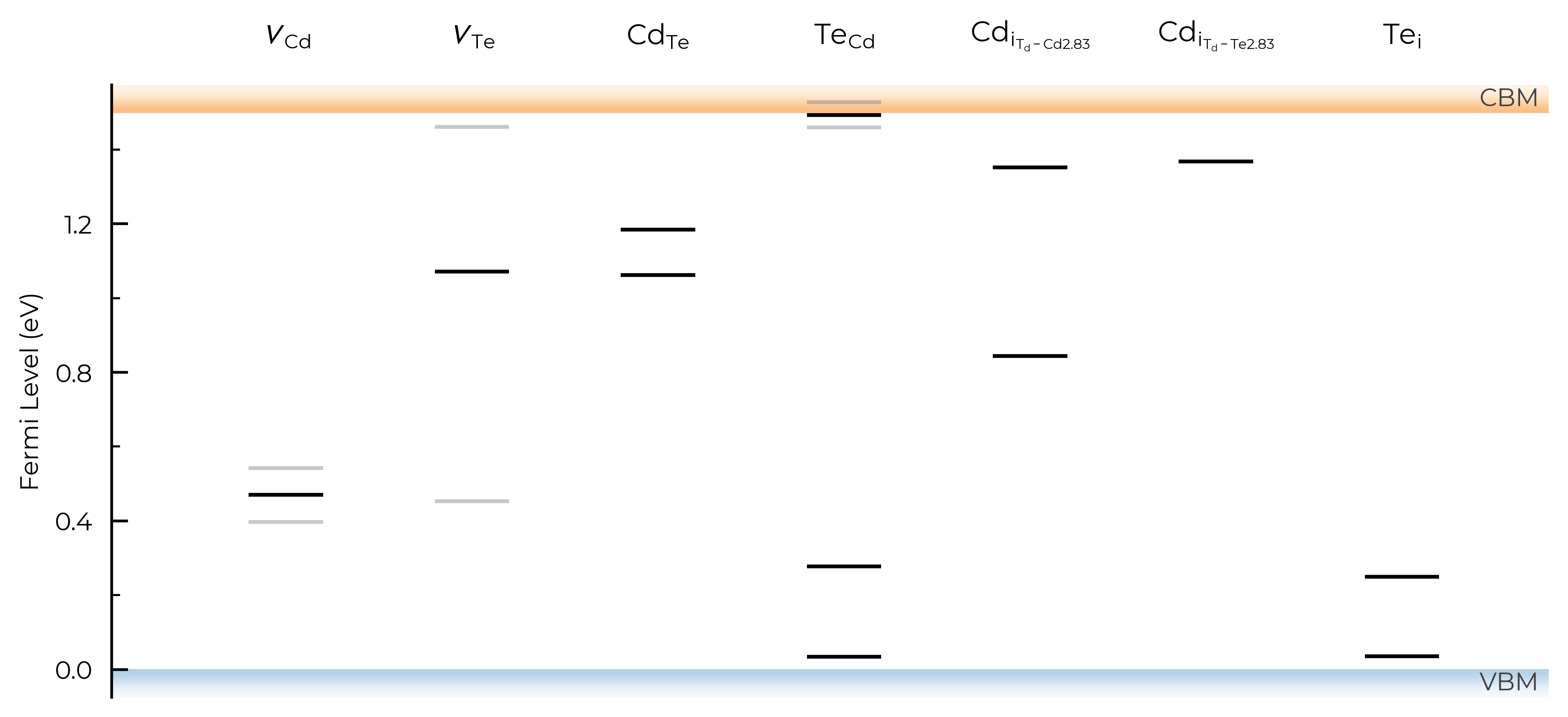
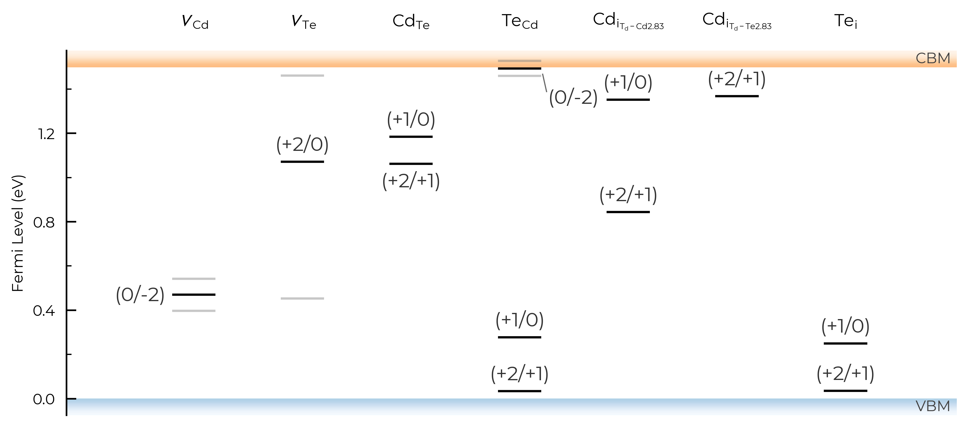
If we set all=True, it will show and label all transition levels, metastable-containing or not:
TL_plot = CdTe_thermo.plot_transition_levels(all=True)
TL_plot = Se_extrinsic_substitutions_thermo.plot_transition_levels(all=True)
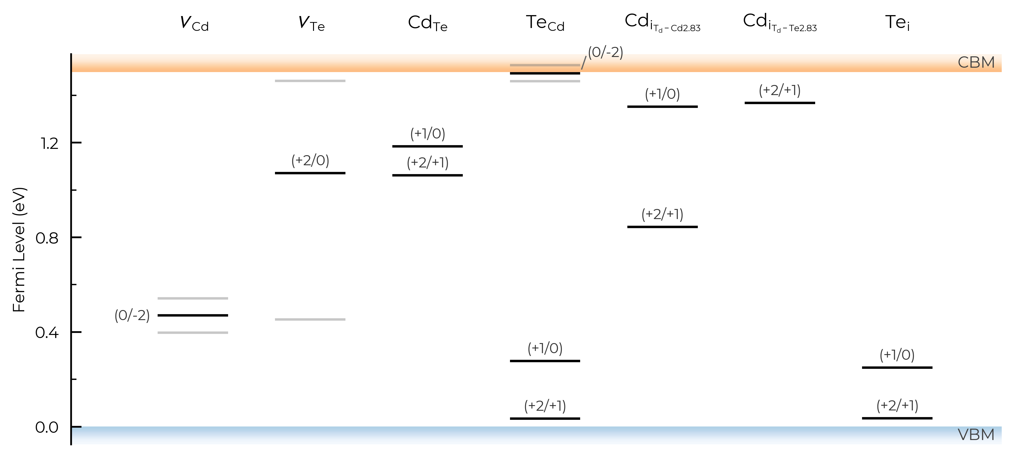
We can also set all="faded_labels", to give the same behaviour as the default all="faded", but with labels for the faded (metastable-containing) TLs:
TL_plot = CdTe_thermo.plot_transition_levels(all="faded_labels")
TL_plot = Se_extrinsic_substitutions_thermo.plot_transition_levels(all="faded_labels")
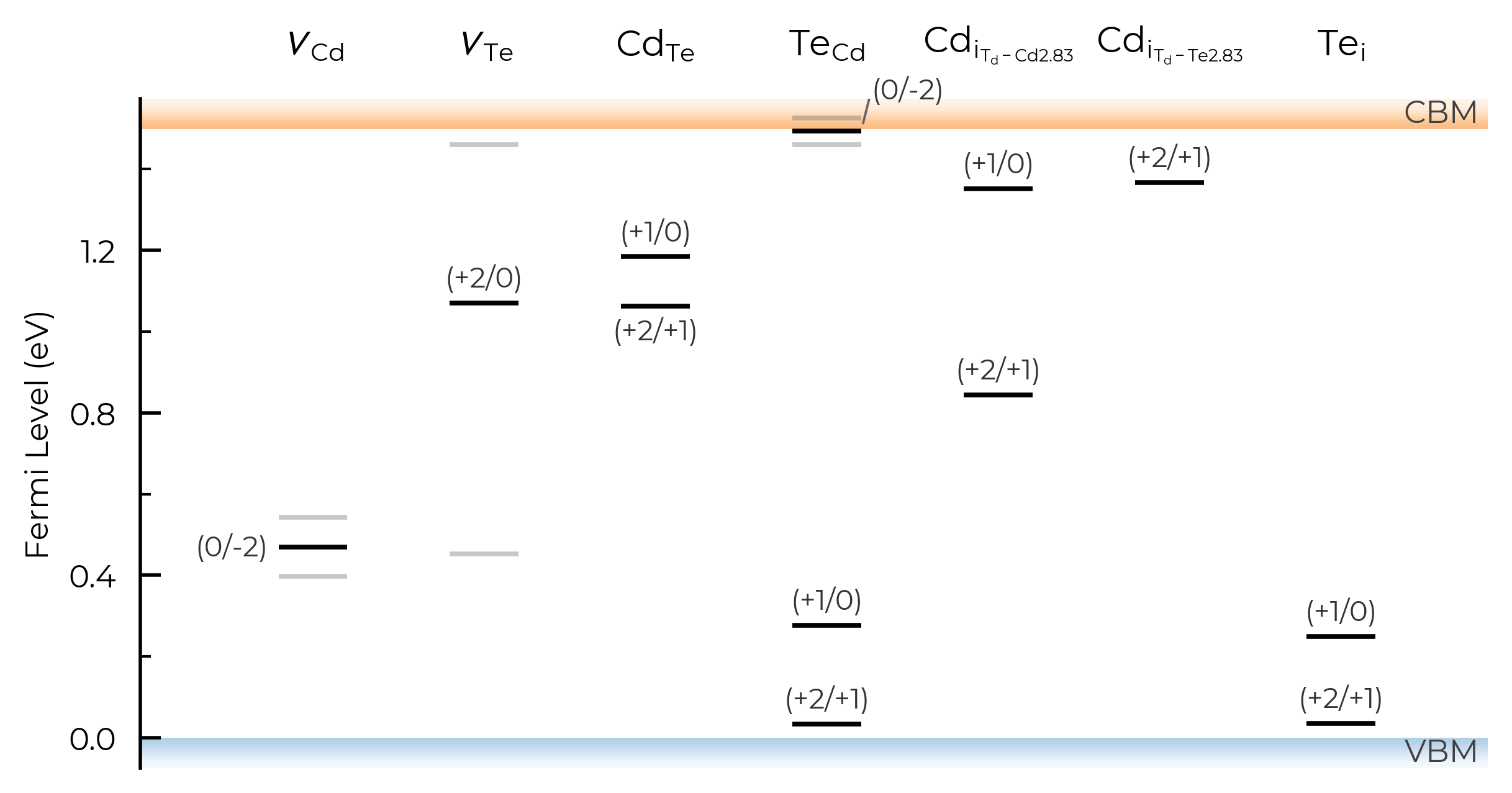
Or we can set all=False to not show any metastable-containing TLs (faded or otherwise):
TL_plot = CdTe_thermo.plot_transition_levels(all=False)
TL_plot = Se_extrinsic_substitutions_thermo.plot_transition_levels(all=False)
dist_tol (TL Plotting)
In the above TL plots, we see doped classified Te interstitials in CdTe as having two separate defect sites. This is dictated by the dist_tol parameter in DefectThermodynamics (= 1.5 Å by default), which groups together defects which have distances between equivalent defect sites within this tolerance – as discussed in the dist_tol section above for defect formation energy plotting.
Let’s increase it to 1.6 Å here to group these Te interstitials together:
CdTe_thermo.dist_tol = 1.6
TL_plot = CdTe_thermo.plot_transition_levels()
If we had many inequivalent defects in a system (e.g. in low-symmetry/complex systems such as Sb₂Se₃), we can set dist_tol to a high value to merge together these many inequivalent defects so that our formation energy plot just shows the lowest energy species of each defect type. Let’s quickly look at monoclinic Sb₂O₅ (a promising Sb(V)-based transparent conducting oxide, with several inequivalent sites) as an example case of this:
sb2o5_thermo = loadfn("../tests/data/Sb2O5/sb2o5_thermo.json.gz") # load our pre-computed Sb2O5 DefectThermodynamics
fig = sb2o5_thermo.plot(limit="O-poor")
TL_plot = sb2o5_thermo.plot_transition_levels()
Let’s set dist_tol to 2.5 , which will merge all inequivalent O interstitials and Sb interstitials in this case:
sb2o5_thermo.dist_tol = 2.5
TL_plot = sb2o5_thermo.plot_transition_levels()
If we set dist_tol even larger, to 3 Å here, this will merge all inequivalent O vacancies as well, so that only the lowest energy states are shown:
sb2o5_thermo.dist_tol = 3
TL_plot = sb2o5_thermo.plot_transition_levels()
See the dist_tol section above for further discussion on this parameter.
defect_subset (TL Plotting))
As with defect formation energy plotting, we can use the defect_subset argument to specify a string or list of strings, where only defects whose name contains at least one of the given (sub)strings will be plotted.
For example, let’s plot just the vacancy defects:
TL_plot = CdTe_thermo.plot_transition_levels(defect_subset="v_") # 'v_' to match vacancies
Alternatively, we could achieve the same result by manually creating a vacancies-only DefectThermodynamics object, as shown in the formation energy plotting section.
unstable_entries & ylim
As with formation energy plotting, we can use the unstable_entries argument to control the plotting or omission of shallow (‘perturbed host’) and unstable defect charge states. See the Electronic Structure Analysis section of the doped Tips page for more info on shallow defect states.
The default setting is unstable_entries = "not shallow", meaning entries which are
detected to be shallow (‘perturbed host’) states and unstable for Fermi levels in the band gap are omitted from plotting for clarity & accuracy.
Let’s use the same example of extrinsic point defects in Se from the unstable_entries section above section above, showing only substitution defects (using defect_subset) and also expanding our y-axis (Fermi level) limits to show tranisition levels in the band continua:
from doped.thermodynamics import DefectThermodynamics
Se_extrinsic_thermo = DefectThermodynamics.from_json( # load our DefectThermodynamics object
"../tests/data/Se_Ext_No_Pnict_Thermo.json.gz")
# no pruning of shallow/unstable states
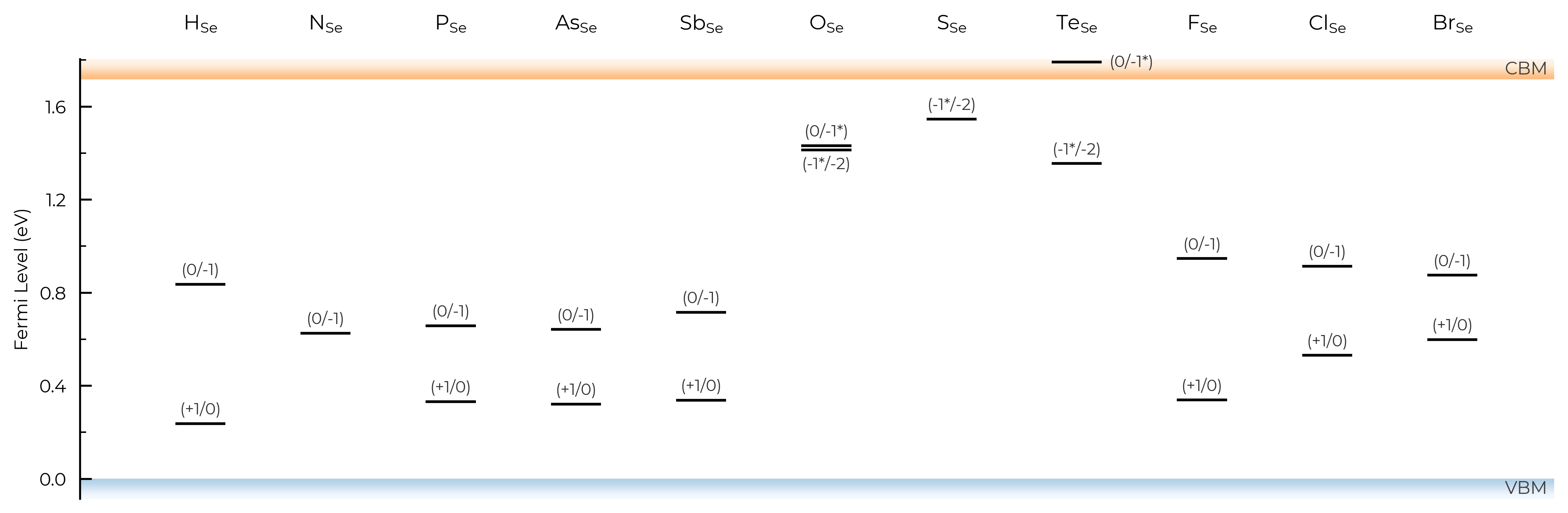
TL_plot = Se_extrinsic_thermo.plot_transition_levels(unstable_entries=True, defect_subset="_Se", ylim=(-0.3, 2))
We can see with the default unstable_entries="not shallow" below here, some +1 charge states for chalcogen substitutions/interstitials (from this paper on defects in Selenium) are now omitted, being unstable for in-gap Fermi levels and having been automatically detected as shallow defects by doped’s eigenvalue analysis:
TL_plot = Se_extrinsic_thermo.plot_transition_levels(unstable_entries="not shallow", defect_subset="_Se", ylim=(-0.3, 2))
See the API docs / docstring for more info on the available unstable_entries choices!
include_site_info (TL Plotting)
The include_site_info argument controls the use of defect site information in the defect names (i.e. column names in the transition level plots). The default setting (None) omits site info unless needed to disambiguate distinct (grouped) defects:
# show site info in all cases where available (interstitial defects here):
TL_plot = CdTe_thermo.plot_transition_levels(include_site_info=True)
# don't show site info -- here the labels "Cd_i-a" and "Cd_i-b" are used to differentiate instead, while "Te_i" needs no additional labelling to disambiguate:
TL_plot = CdTe_thermo.plot_transition_levels(include_site_info=False)
show_charge_labels
# no charge labels:
TL_plot = CdTe_thermo.plot_transition_levels(show_charge_labels=False)
show_band_labels
# no band (VBM/CBM) labels:
TL_plot = CdTe_thermo.plot_transition_levels(show_band_labels=False)
label_fontsize
# adjust label fontsize:
TL_plot = CdTe_thermo.plot_transition_levels(label_fontsize=12)
column_width
# adjust column width (default = 0.4):
TL_plot = CdTe_thermo.plot_transition_levels(column_width=0.6)
figsize
# adjust figure size
TL_plot = CdTe_thermo.plot_transition_levels(figsize=(7,3.5))
style_file & filename
As with formation energy plotting, we can adjust the overall style of the plot by using a custom matplotlib style (mplstyle) file, and can also automatically save to file by providing filename:
with open("custom_style.mplstyle", "w") as f:
    f.write("ytick.right : True\nxtick.top : True\nfont.sans-serif : Helvetica")
TL_plot = CdTe_thermo.plot_transition_levels(style_file="custom_style.mplstyle", filename="test.pdf")
!ls *pdf
!rm test.pdf
test.pdf
Editing Output Figure
All doped plotting functions also return the matplotlib Figure object of the plot, and so this allows us to further edit and customise the figure as desired.
For instance, let’s plot a diverging heatmap from the band gap centre decaying out to the band edges (which could indicate expected carrier emission/capture rates):
import numpy as np
fig = CdTe_thermo.plot_transition_levels()
ax = fig.axes[0]
xlim, ylim = ax.get_xlim(), ax.get_ylim()

# value peaks (=0) at the gap centre and decreases symmetrically towards the band edges:
y = np.linspace(ylim[0], ylim[1], 256)
profile = -np.abs(y - CdTe_thermo.band_gap / 2)
grid = np.tile(profile[:, np.newaxis], (1, 2))  # vary only along the Fermi-level (y) axis
ax.imshow(
    grid,
    extent=(xlim[0], xlim[1], ylim[0], ylim[1]),
    origin="lower",
    aspect="auto",
    cmap="Reds",
    vmin=-CdTe_thermo.band_gap / 2,  # symmetric about the gap centre
    vmax=CdTe_thermo.band_gap / 2,  # only ever reaches 50% vmax, to keep colours light and avoid greying out
    zorder=-10,  # behind the TL lines/labels
);
In other cases you may want to edit the transition levels themselves, perhaps sizing or colouring them according to their carrier capture rate, concentration, or radiative emission rate – see Kawashima & Botti arXiv 2026 for a nice example. For more complex examples such as this, you may want to directly copy and modify the doped plotting code (likely with the help of genAI, being careful to sanity check the outputs of course).
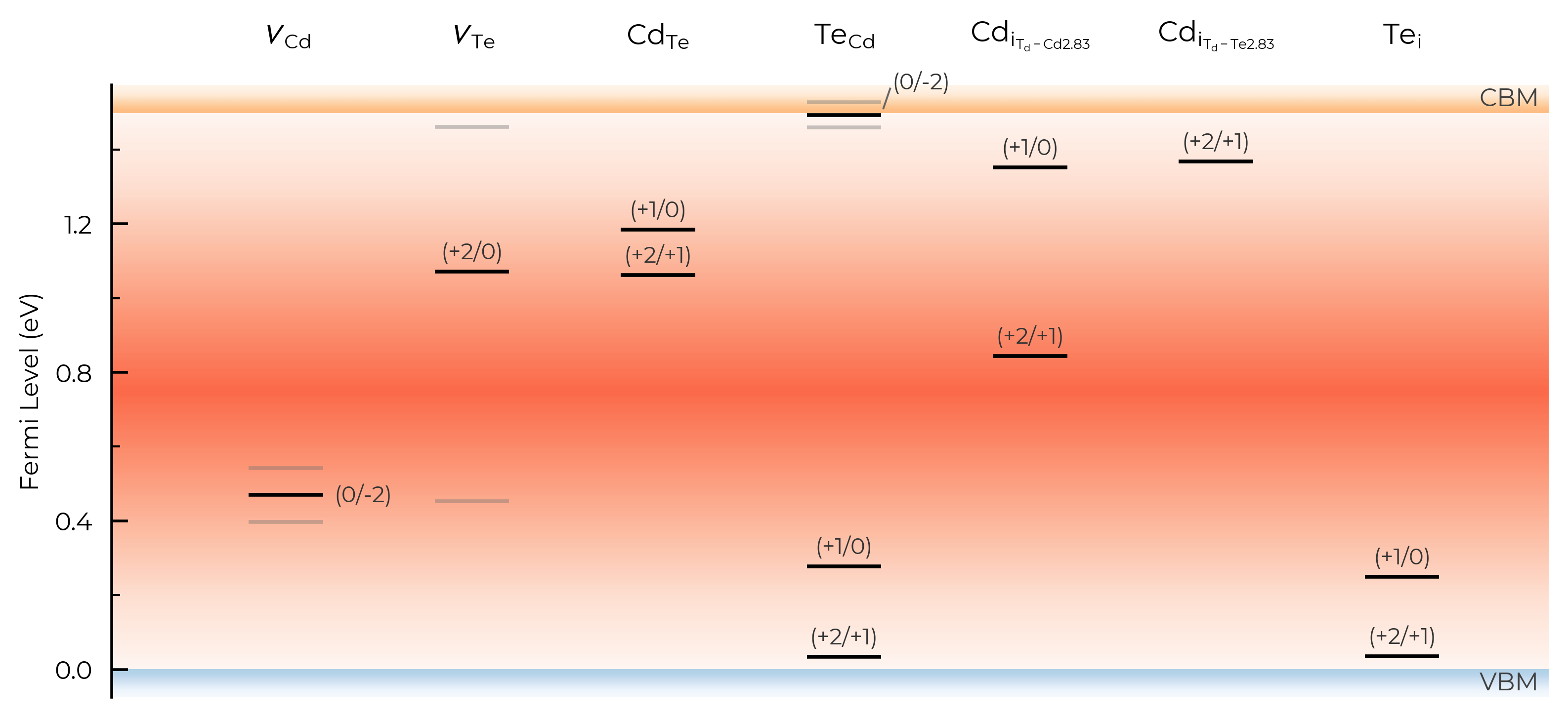
Chemical Potential Heatmaps
The CompetingPhasesAnalyzer.plot_chempot_heatmap method has many options, and as always returns the Matplotlib Figure object to allow further customisation.
# 4-D system:
from monty.serialization import loadfn

Cs2AgBiBr6_ncl_cpa = loadfn("../tests/data/ChemPotAnalyzers/Sn_in_Cs2AgBiBr6_ncl_cpa.json")
plot = Cs2AgBiBr6_ncl_cpa.plot_chempot_heatmap(
    dependent_element="Bi",  # change dependent (colourbar) element
    fixed_elements={"Cs": -3.3815},
    xlim=(-0.4, 0.0),
    ylim=(-0.6, -0.2),
    cbar_range=(-2, -1),
    colormap="navia",
    padding=0.05,
    title=True,
    label_positions={
        "CsAgBr3": (-0.3, 0.025),
        "AgBr": (-0.16, 0.0),
        "Cs3Bi2Br9": (-0.1, -0.05),
    },  # custom label positions
    style_file=f"../doped/utils/displacement.mplstyle",  # custom style file
)
Chemical potential heatmap plotting requires 3-D data, requiring fixed chemical potential constraints for >ternary systems; such that the number of elements in the chemical system (5) minus the number of fixed chemical potentials (1) must be equal to 3. The following chemical potentials will additionally be constrained to their mean (centroid) values in the chemical stability region: {'Ag': np.float64(-0.1641)}
Finite-Size Charge Correction Plots
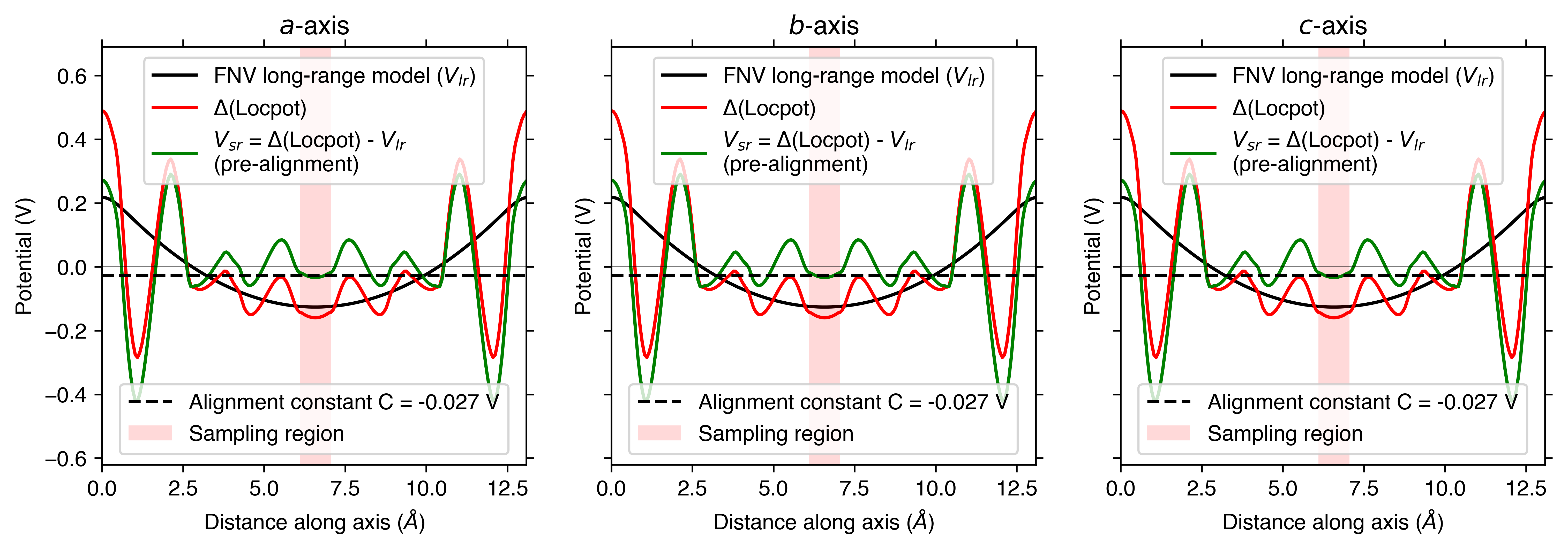
Both the Freysoldt (FNV) and Kumagai (eFNV) charge correction plots in doped are also quite customisable, and as always return the Matplotlib Figure object to allow further customisation.
eFNV (Kumagai) Correction
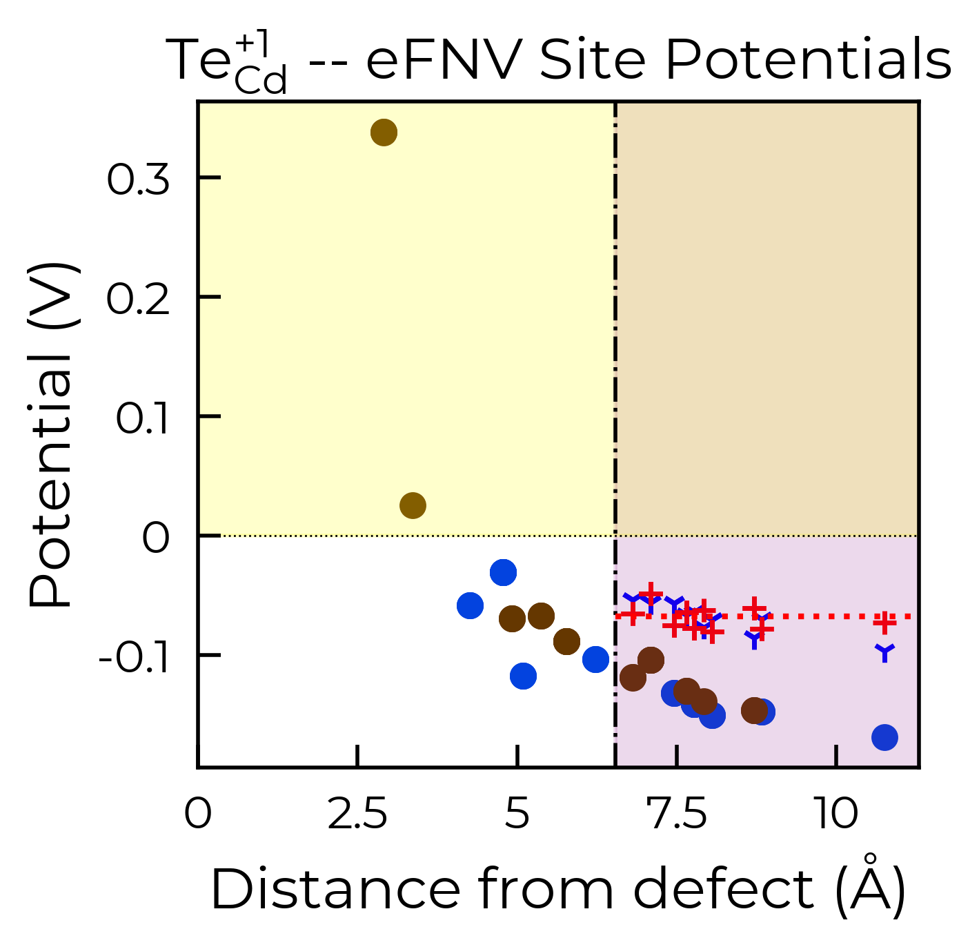
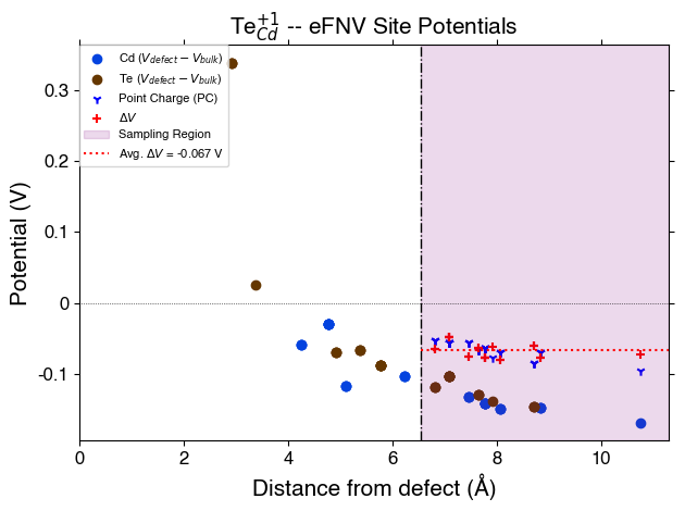
As shown in the doped docs Tips page, we can set defect_region_radius and/or excluded_indices with the eFNV correction (get_kumagai_correction()) to control which sites away from the defect site are used to determine the potential alignment – which we may want to do with e.g. low-dimensional materials.
te_cd_entry = CdTe_thermo.defect_entries["Te_Cd_+1"]
correction, fig = te_cd_entry.get_kumagai_correction(plot=True)
Calculated Kumagai (eFNV) correction is 0.238 eV
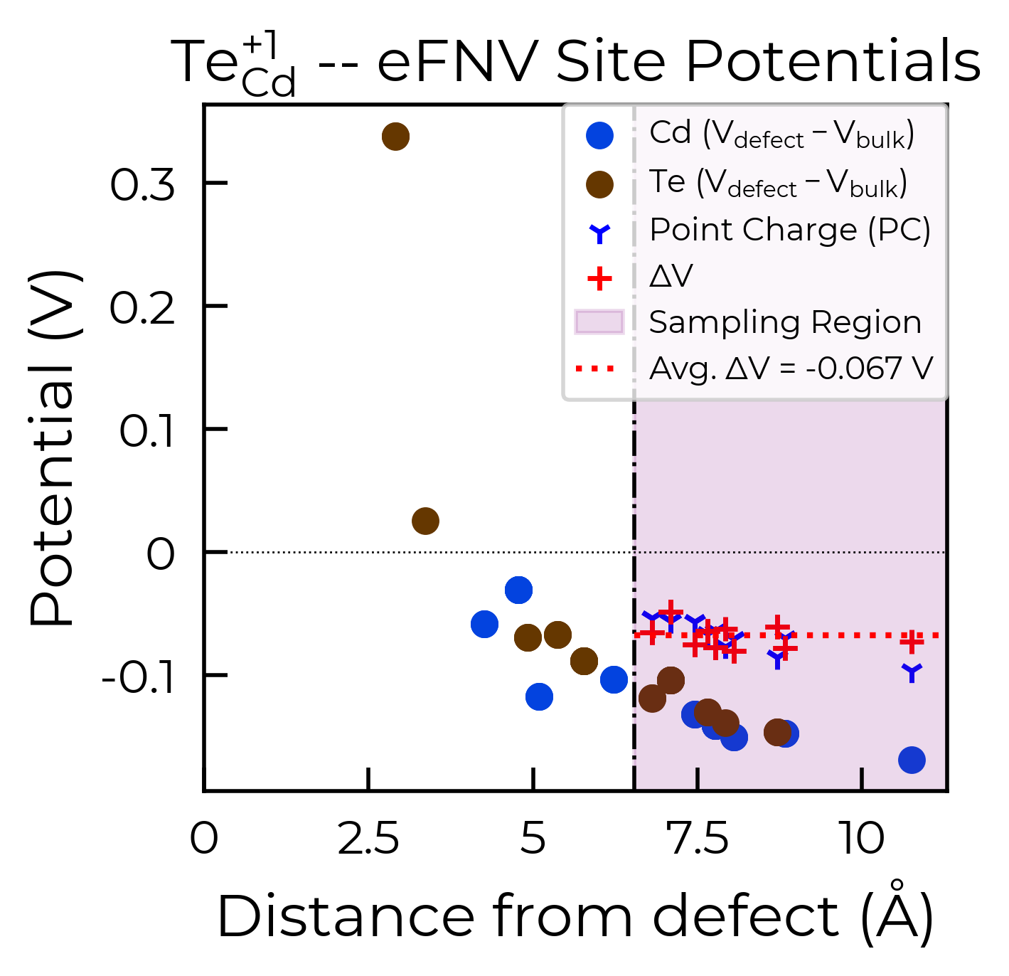
As with the defect formation energy plots, because this function also returns the Matplotlib Figure object, we can further customise the plot as we see fit. To illustrate, here we remove the legend from the plot and shade the region where the potential is positive in yellow:
correction, fig = te_cd_entry.get_kumagai_correction(plot=True)
ax = fig.gca()  # get axis object
ax.get_legend().remove()  # remove legend
ax.axhspan(0, 100, alpha=0.2, color="yellow")
Calculated Kumagai (eFNV) correction is 0.238 eV
<matplotlib.patches.Rectangle at 0x17f313610>
style_file (for eFNV charge correction plots)
As with the defect formation energy plots, we can adjust the overall style of the plot by using a custom matplotlib style (mplstyle) file:
with open("custom_style.mplstyle", "w") as f:
    f.write("ytick.right : True\nxtick.top : True\nfont.sans-serif : Helvetica")
correction, fig = te_cd_entry.get_kumagai_correction(plot=True, style_file="custom_style.mplstyle")
Calculated Kumagai (eFNV) correction is 0.238 eV
FNV (Freysoldt) Correction
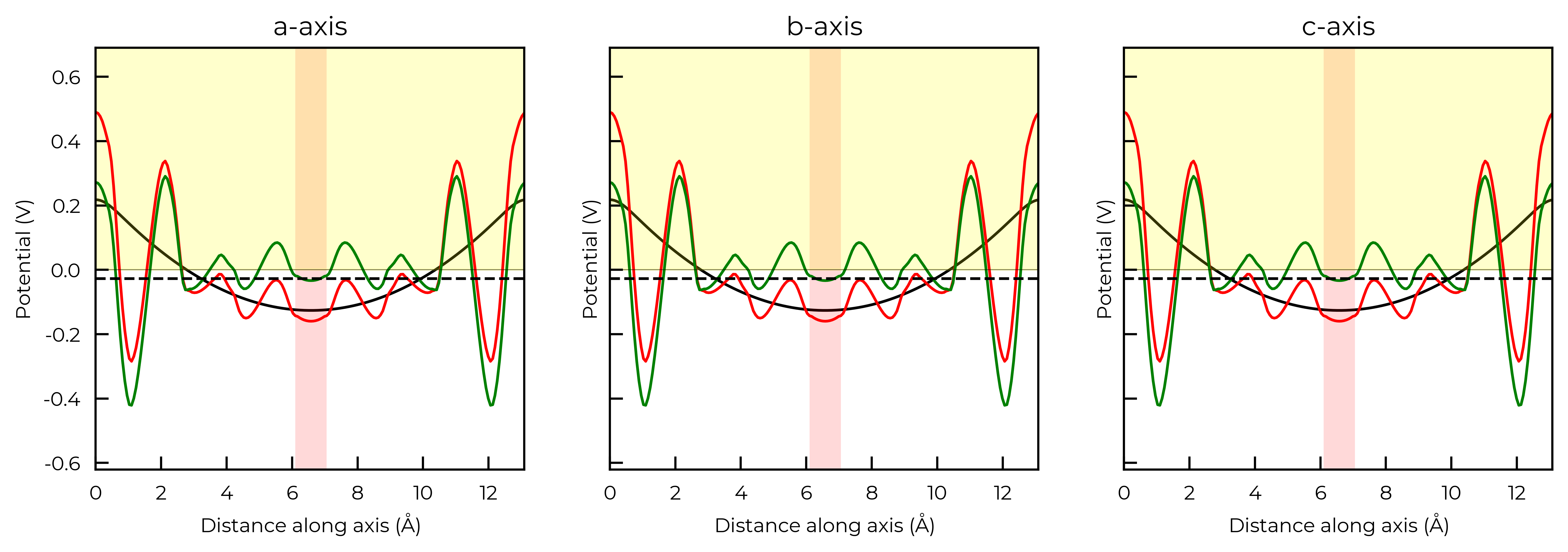
Remember, the Freysoldt (FNV) correction is only valid for isotropic systems!
v_cd_entry = CdTe_thermo.defect_entries["v_Cd_-2"]
correction, fig = v_cd_entry.get_freysoldt_correction(plot=True)
Calculated Freysoldt (FNV) correction is 0.738 eV
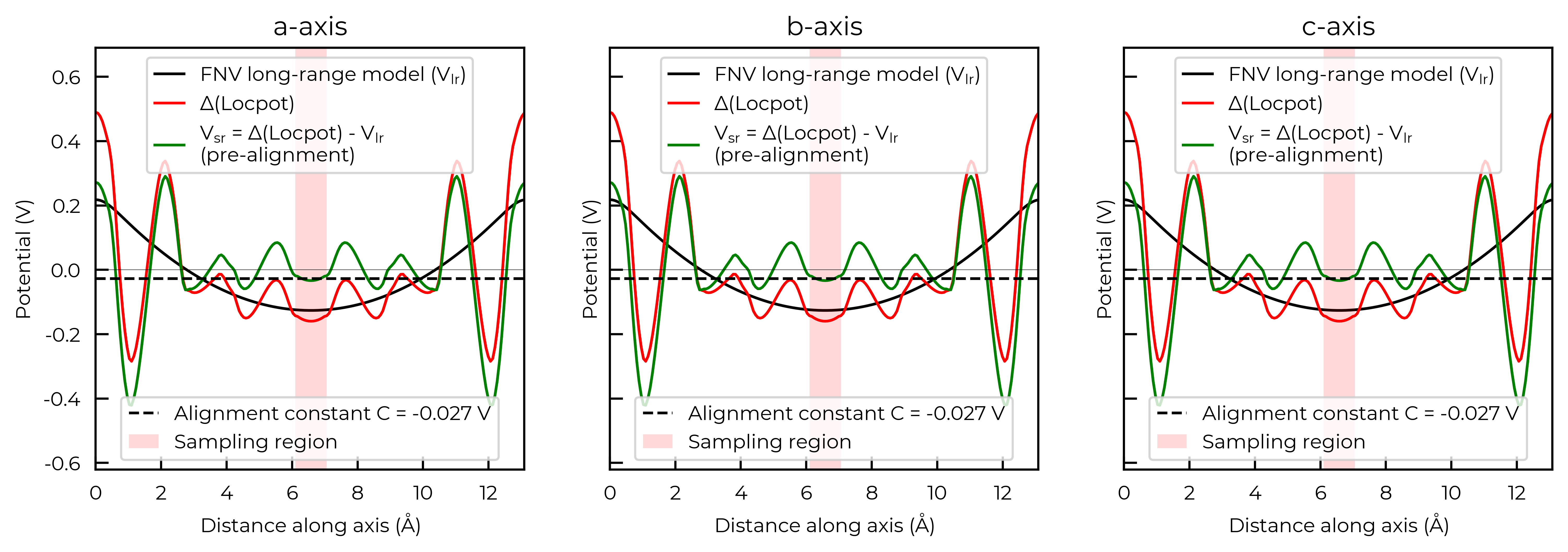
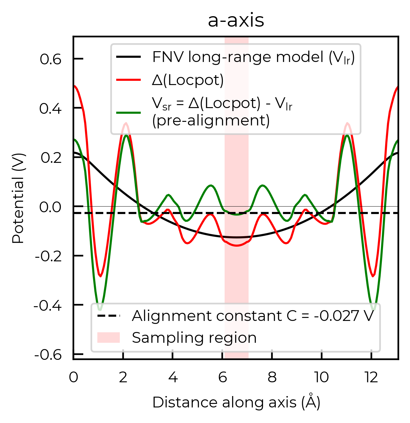
For the FNV correction, it calculates the electrostatic potential alignment along the a, b and c axes and then computes the average. We can focus on just one axis at a time by setting axis:
correction_a, fig_a = v_cd_entry.get_freysoldt_correction(plot=True, axis=0)
Calculated Freysoldt (FNV) correction is 0.738 eV
Again, because this function also returns the Matplotlib Figure object, we can further customise the plot as we see fit. To illustrate, here we remove the legends from each plot and shade the region where the potential is positive in yellow:
correction, fig = v_cd_entry.get_freysoldt_correction(plot=True)
for ax in fig.get_axes():
    ax.get_legend().remove()  # remove legend
    ax.artists[0].remove()  # shade the region where the potential is positive
    ax.axhspan(0, 100, alpha=0.2, color="yellow")
Calculated Freysoldt (FNV) correction is 0.738 eV
style_file (for FNV charge correction plots)
As with the defect formation energy plots, we can adjust the overall style of the plot by using a custom matplotlib style (mplstyle) file:
with open("custom_style.mplstyle", "w") as f:
    f.write("ytick.right : True\nxtick.top : True\nfont.sans-serif : Helvetica")
correction, fig = v_cd_entry.get_freysoldt_correction(plot=True, style_file="custom_style.mplstyle")
Calculated Freysoldt (FNV) correction is 0.738 eV
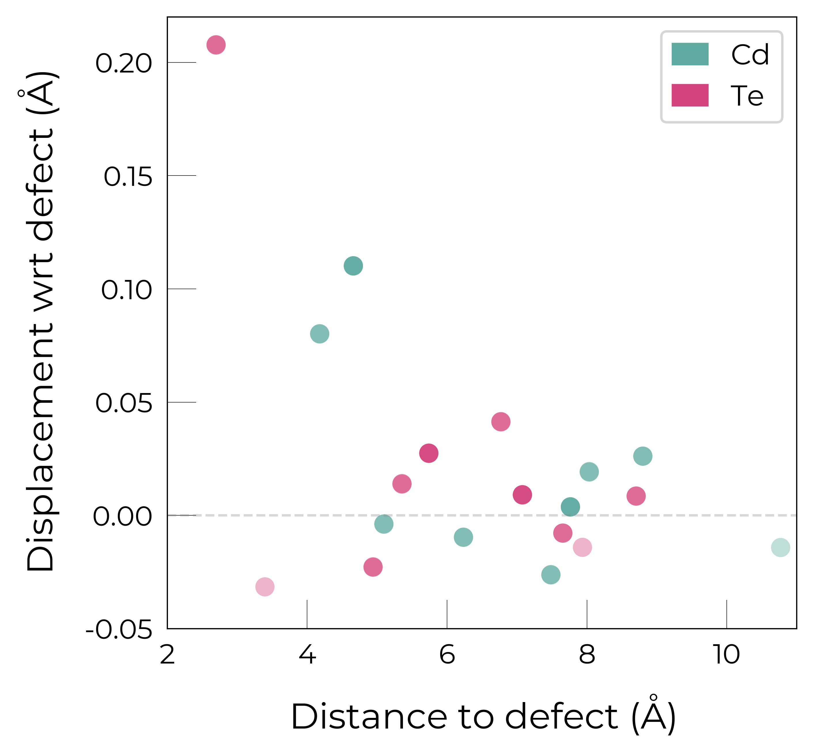
Site Displacement / Strain Plots
As shown in more detail in the advanced analysis tutorial, the DefectEntry.plot_site_displacements() method and functions in doped.utils.displacements can be quite useful for analysing the lattice response (site displacements) and local strain for a relaxed defect structure.
Again, these functions return the Matplotlib Figure object to allow further customisation (more examples shown in the advanced analysis tutorial):
te_cd_entry = CdTe_thermo.defect_entries["Te_Cd_+1"]
fig = te_cd_entry.plot_site_displacements()
ax = fig.gca()
ax.set_xlim(2, 11)
ax.set_ylim(-0.05, 0.22);  # adjust x/y-lims
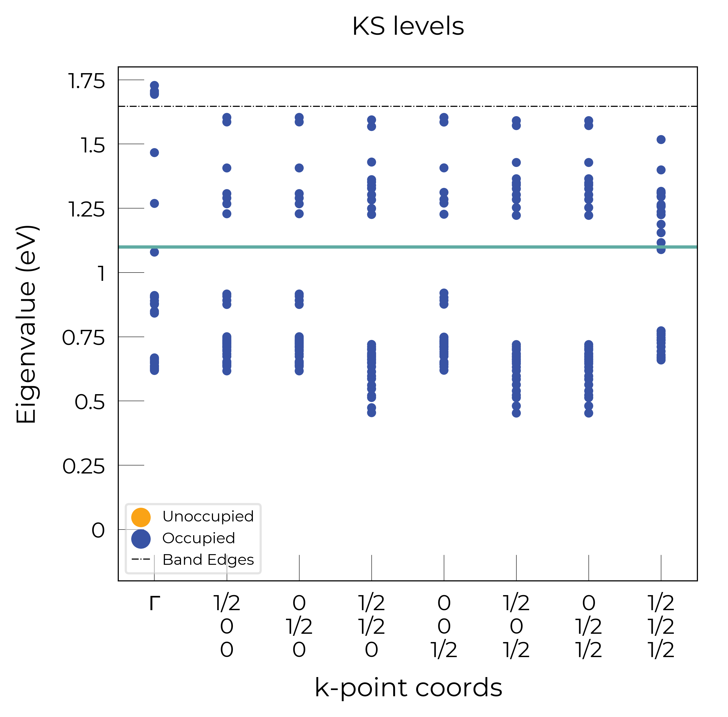
Eigenvalue Plots
As shown in more detail in the advanced analysis tutorial, the DefectEntry.get_eigenvalue_analysis() method and functions in doped.utils.eigenvalues can be quite useful for analysing the electronic structure of our defect calculations.
Again, these functions return the Matplotlib Figure object to allow further customisation:
te_cd_entry = CdTe_thermo.defect_entries["Te_Cd_+1"]
bes, fig = te_cd_entry.get_eigenvalue_analysis()
# adjust ylim and add line around defect level:
ax = fig.axes[0]
ax.set_ylim(-0.2, 1.8), ax.axhline(1.1)
((-0.2, 1.8), <matplotlib.lines.Line2D at 0x3b68651d0>)